The final piece of promotion I made for my Little Bites brand was mock-ups showing social media accounts and social media posts. I used the posters I have made before and made some other designs to go onto the accounts as well.
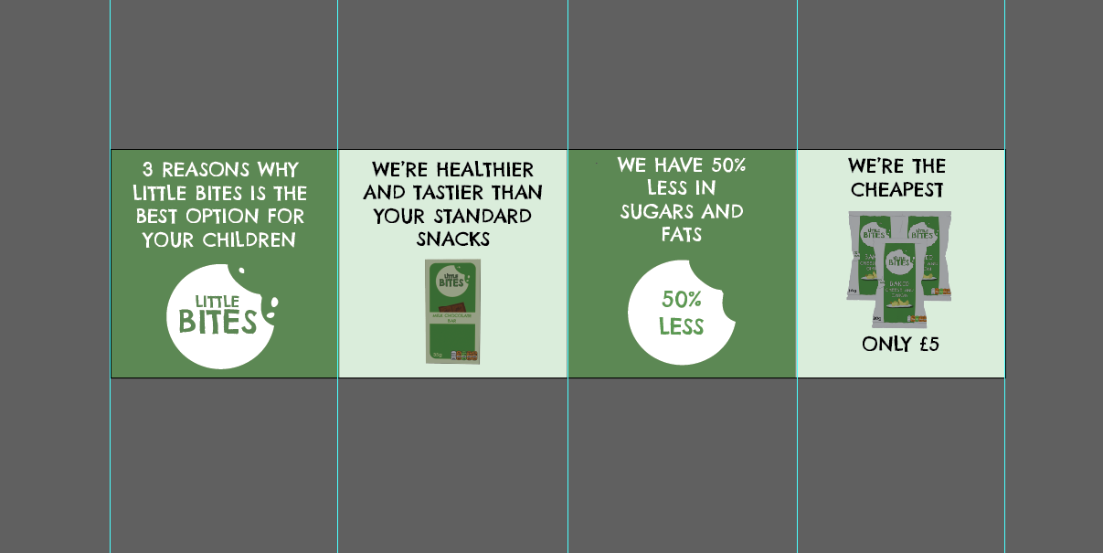
The social media accounts I have focused on are Instagram and Facebook because these are the two social media sites that I have used icons for on my packaging designs and the website design. I started off by designing a post for Instagram which uses the carousel post format to make a slideshow of reasons why you should choose Little Bites products. To make this design, I used Illustrator, and I made a long continuous design which I then gridded out to split into 4 equal sections that fit Instagram’s square post ratio. I did this so that the carousel is a continuous design and each slide smoothly transitions from the last. I switched between brand colours for each slide and used images of the products as I listed each reason, such as ‘we are healthier and tastier than your standard snacks’, and ‘we have 50% less in fats and sugars’. I have spoken in direct terms such as ‘you’ and ‘we’ because it feels more personal and connecting to the audience. “Speaking directly to your audience by using the word “you” throughout your copy makes it customer-centric. And this is absolutely correct! You should always be putting your audience first.” (C.W, 2023).
How I set up a guide for the Instagram carousel post
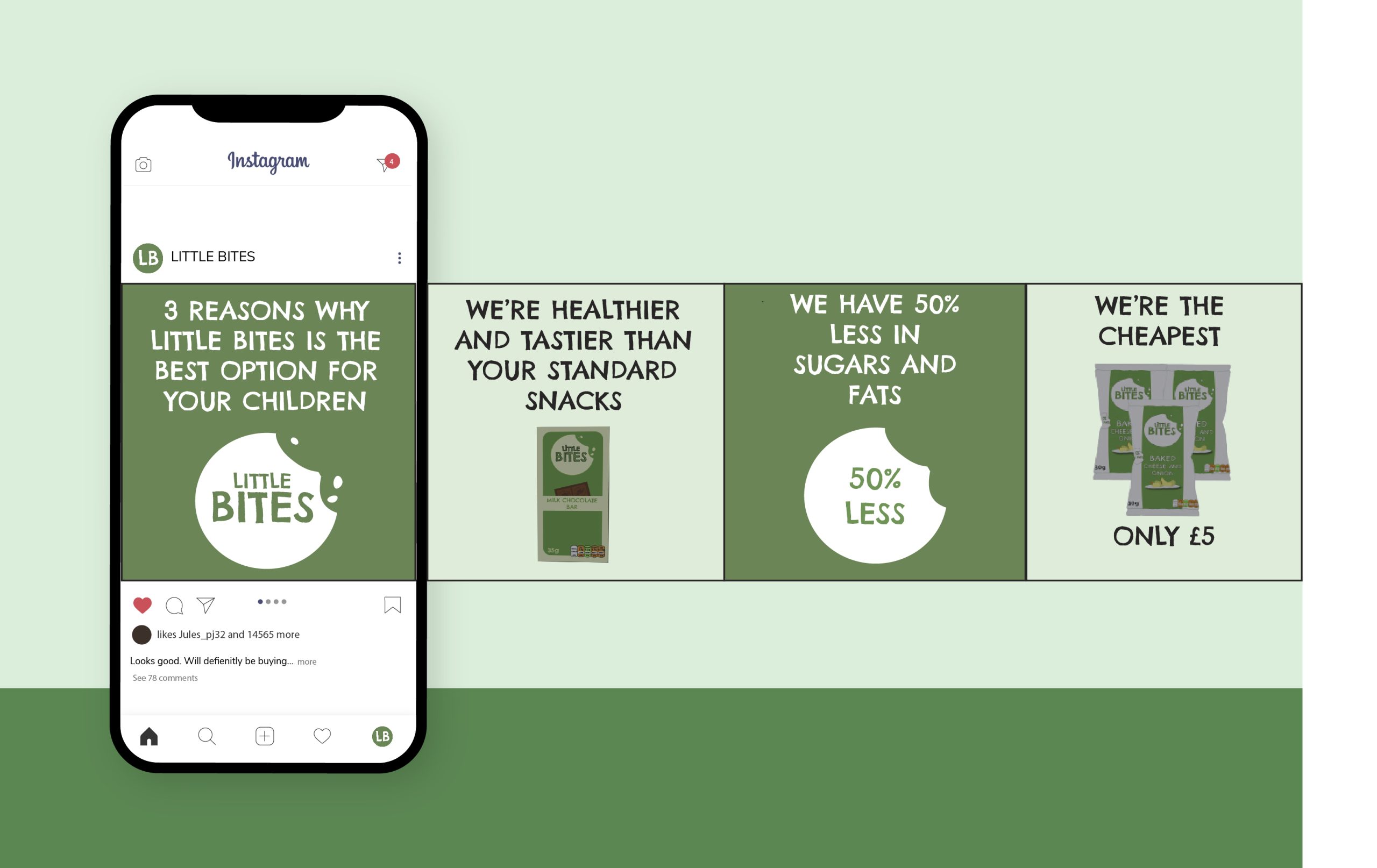
Then using Freepik, I searched for an Instagram carousel mockup to show the design on an Instagram feed. You can now see how the carousel leads from one slide to another and tells a story as you scroll through.
Instagram carousel mock-up
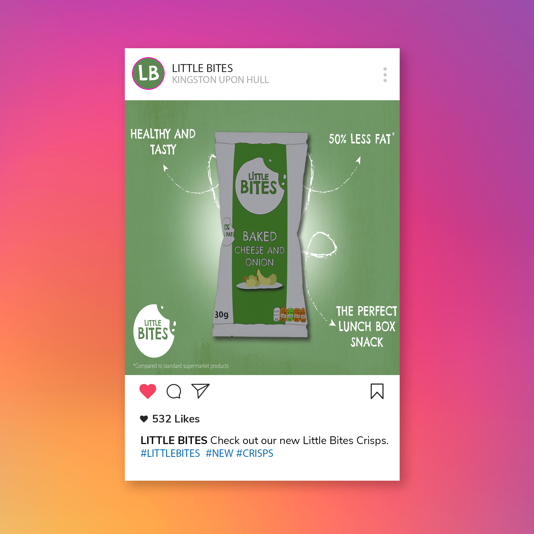
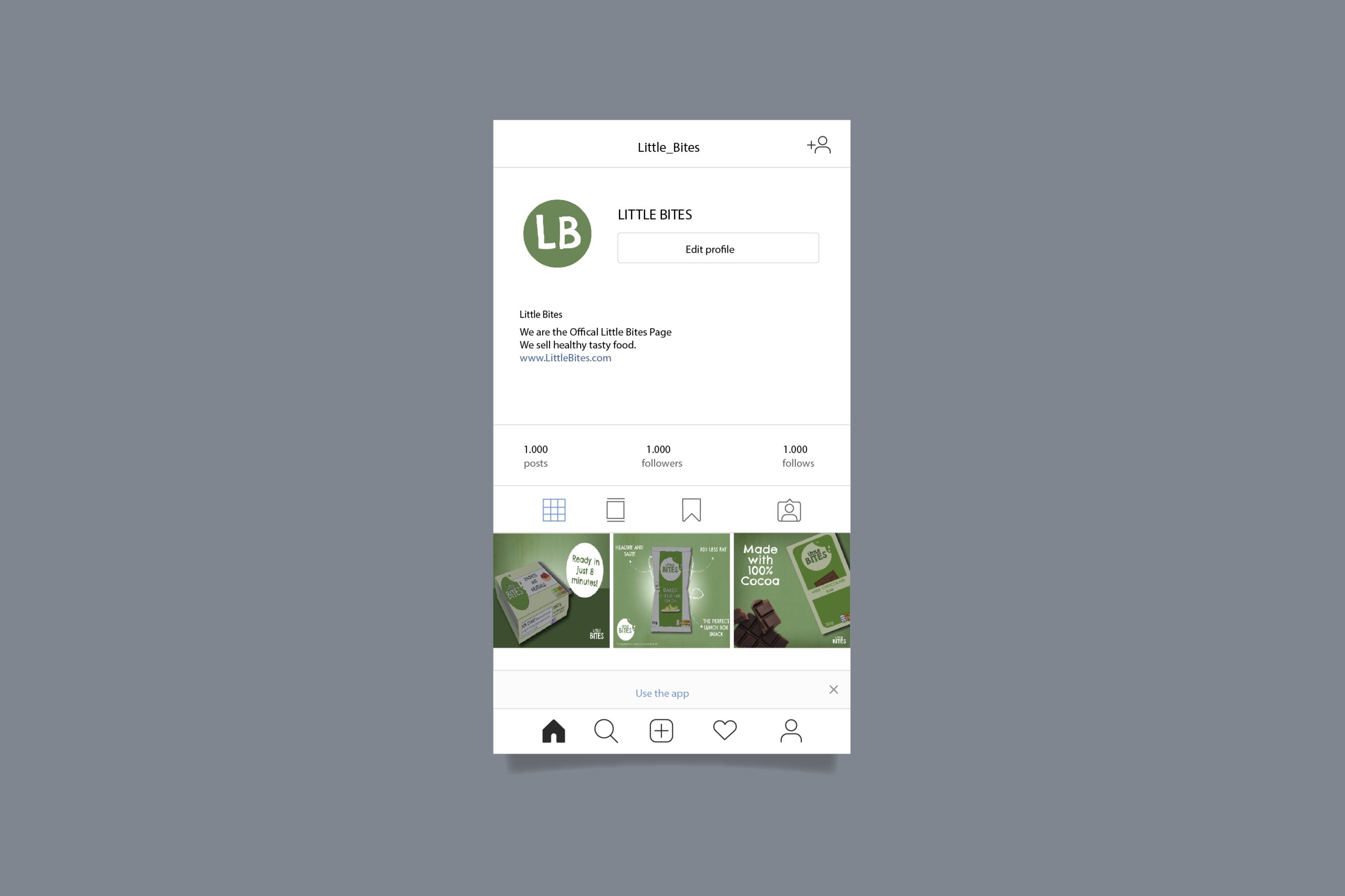
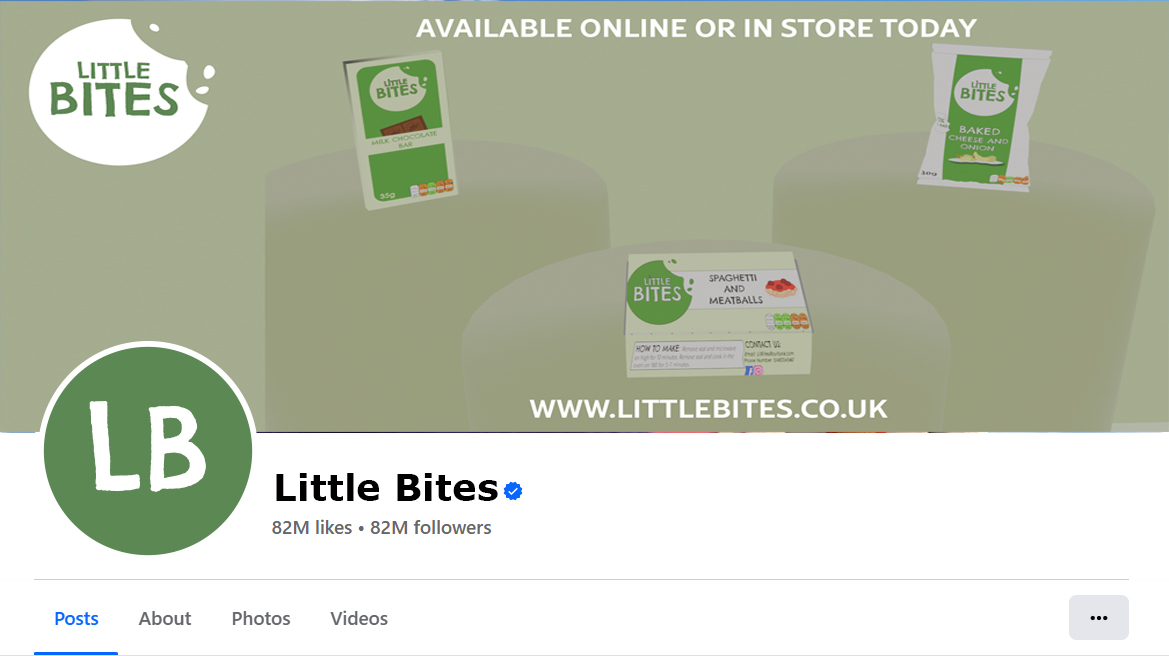
I also made a mockup for an Instagram profile. I did this by downloading an Instagram profile mockup and I added in my brand name, logo and a bio which describes the brand and links to the website to order. For the logo, I used just the two initials ‘LB’ because of how small the Instagram display image is, which means the full logo wouldn’t be as easy to read. Because the profile picture uses the brand colours and font, it is still recognisable to the brand. For the image grid, I used the poster designs I made before to use as posts. To see one of the poster designs up close as an Instagram post, I made another single post mock-up and added the same branding and a caption relating to the post, which reads ‘Check out our new Little Bites crisps’, and some hashtags like #littlebites #new #crisps, which makes it easier for new customers to discover the brand through the tags.
Mockup for a single Instagram post
Instagram account mockup
I then moved onto the Facebook mockups. I made a Facebook page mockup by screenshotting an existing Facebook page and using Photoshop to replace the profile image, the banner image, and the page name. Facebook use ‘Facebook sans’, which is their own custom typeface designed by Erik Olsen (Oliver, 2023). It is not available to use online and so I instead had to look for a similar sans serif font that resembled the Facebook Sans font. I found Verdana, an Adobe font which looked very close to Facebook sans. I used the same display image as the Instagram design but made it bigger to match the Facebook display, and I then made a banner image. For the banner, I added the main logo and arranged the brand products to show them off, so that when someone visits the page it will be what they see first of all. I also added some text to encourage visitors to order the products today or to buy in-store, and a link to the website page.
Facebook page mock-up
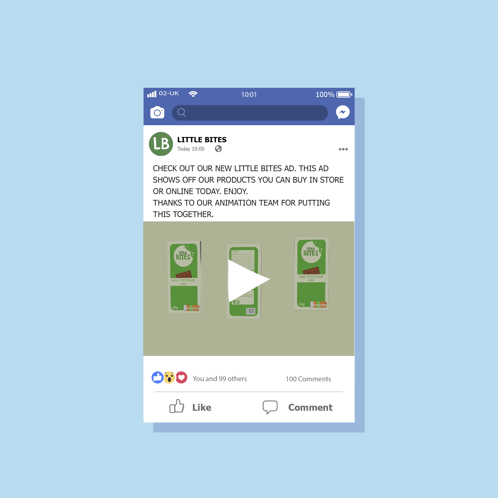
I then made a mock-up showing a Facebook post by Little Bites which is thanking the animation team for creating an animation. I used the animation I made before, but I have spoken as if a team have made it so that it feels more professional as a big brand would have a dedicated team of designers who create animations and designs.
Food brands have websites where customers can view their products and make orders or receive customer support and find out more about the company. I have decided to make a website page for Little Bites so customers can easily buy items and keep up to date with new releases or flavours.
McDonald's website landing (own screenshot)
McDonald's website section (own screenshot)
McDonald's website section (own screenshot)
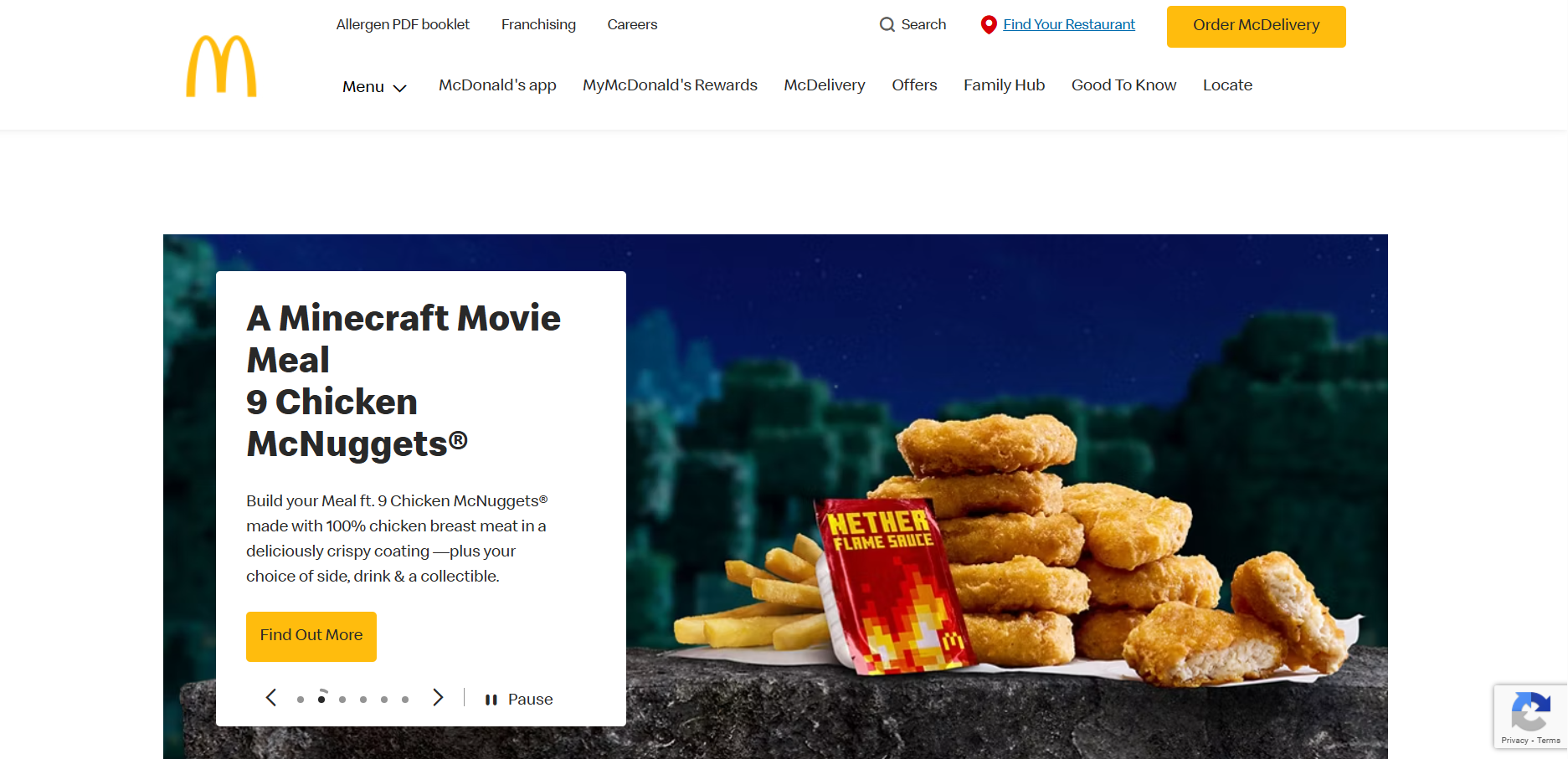
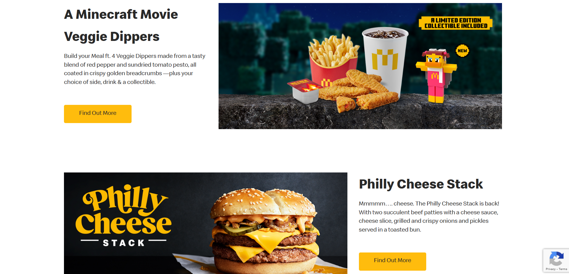
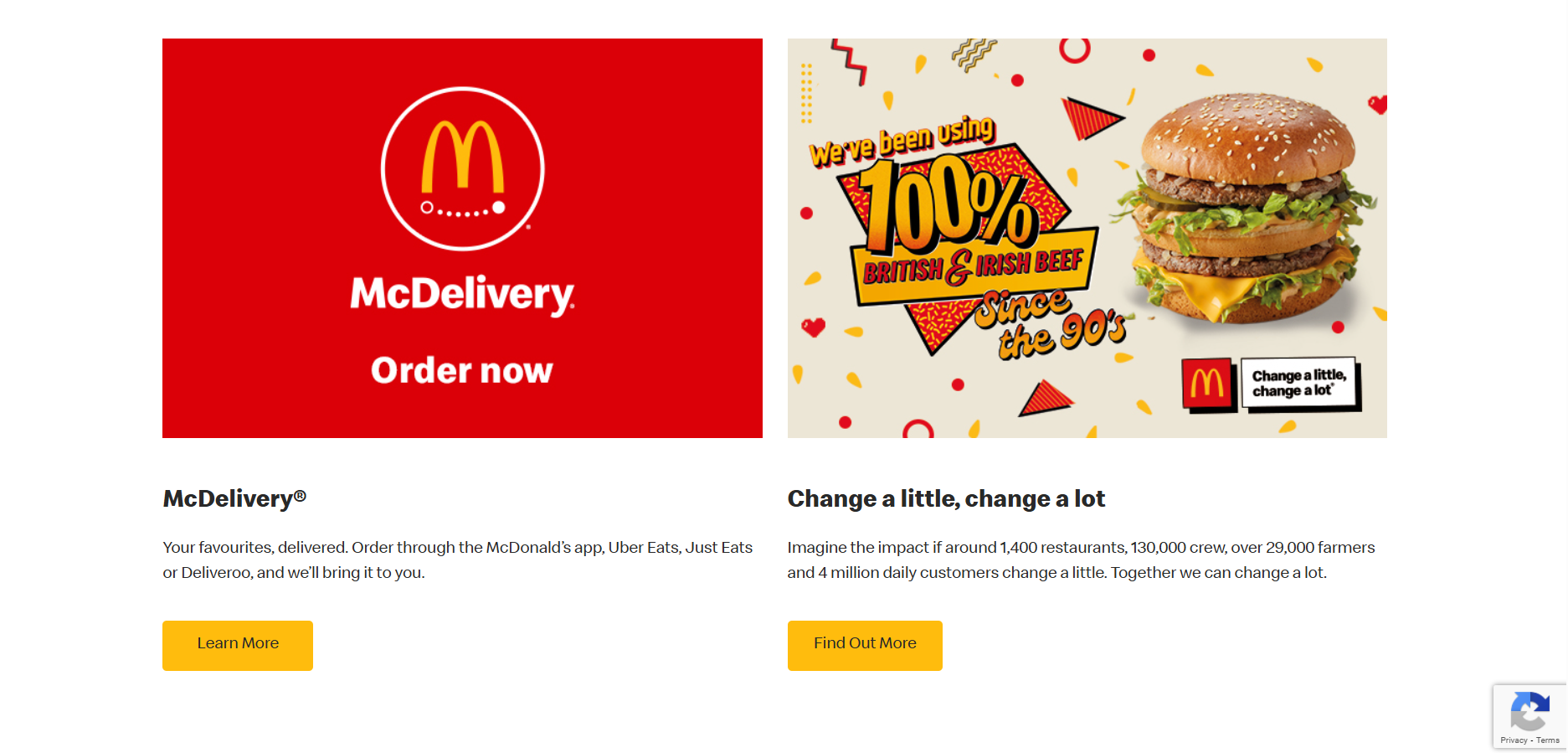
I have looked at some websites for inspiration to see how they display information and what they include. I started with McDonald’s as they are one of the most well-known food brands and their website will be high quality. Their website has a navigation across the top where the first thing you can look at is their menu to see the products they sell, and then things such as their rewards and offers. Then there is a large image slideshow which links to recent news in the brand, like their new happy meal collaborations and saver menu. As you scroll on the layout switches between image-text, text-image on opposite sides which makes balance and is easy to follow. There are call to actions on each section to find out more about featured products or offers. At the bottom is a contact box and a footer which has links to their social media sites and to the terms and conditions.
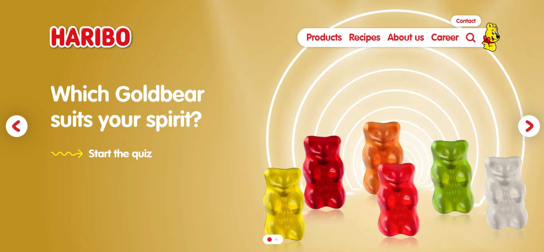
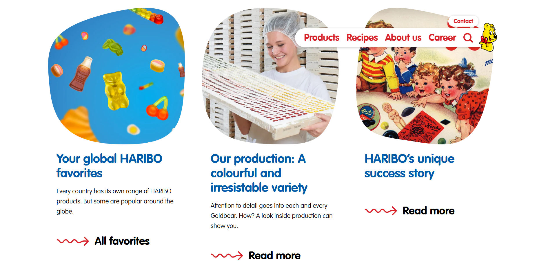
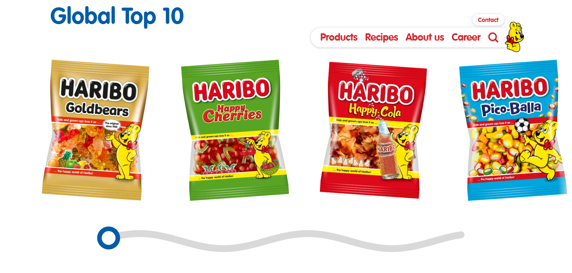
I then looked at the Haribo’s website, which was more kid-friendly than McDonald’s with less links of the navigation and bright colours and shapes and squiggles. There is a large image across the top of the page which links you to a quiz and shows animated gummy bears dancing, which is more appealing to children visiting the website. Then their website is constantly changing layouts for each section to keep it varied, with a row of three news articles and call to actions to read more, and a video showing an advert. I also saw that the images weren’t square or rectangular but rounded and more random, something kids will find more fun. I also think the changing layouts will be more appealing because it keeps it different and more exciting to scroll through. At the bottom of the page is a horizontal scrolling section which is designed like a squiggled line and a circle which can be used to move back and forth. The motion is very fun to interact with and makes the website more playful.
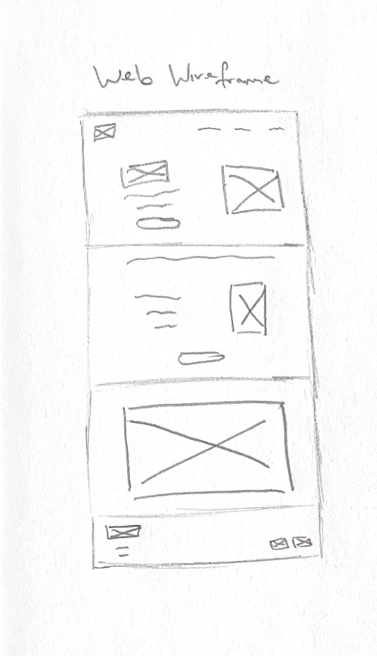
Website wireframe sketch
After gathering inspiration, I have made a wireframe for the website layout. I have made a wireframe sketch for a long website home page and sectioned it into four parts, a landing, a section for new products and a call to action to order, a section for the animation I made, and a footer section with links to social media sites and contact information such as addresses.
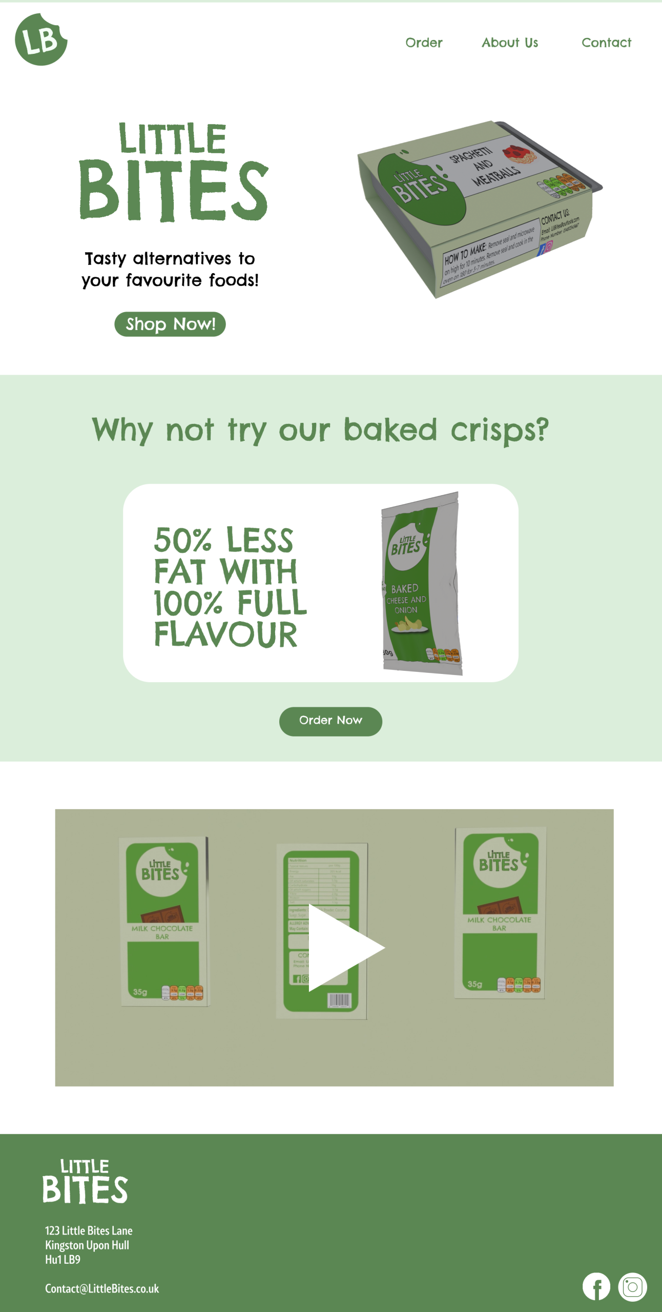
Little Bites website
I used Figma to make the high-fidelity design and used a 1920×1080 frame as it is the standard website size. I used my brand colours and the logo for the landing page and made a navigation bar. I made the navigation shorter with less links because I thought the McDonald’s navigation had too many links compared to the Haribo’s one which worked better for kids. I used an image of my products and the other logo style to make an attention grabbing first impression, I also added a call to action underneath the text to get users to shop now. The text is to the left and the image is to the right, but for the next section I used a central alignment to create variety. For this section, I used an image of the crisps with the text “why not try our baked crisps?”. I used a white box shape to break the green and to make this stand out more and I used the tagline “50% less fat, 100% flavour” to show that the crisps were lower in fat but still just as tasty.
The next section shows a video preview of the animation and takes up the full space. For the top and bottom sections, I used the same colour background, but for the middle section I used green to make an alternating effect which made the design more varied as it switched back and forth.
And then for the footer, I added the logo again and an address and an email that customers can contact the company on. In the bottom corner are the links to the Instagram and Facebook pages, and I used Illustrator to make these icons myself.
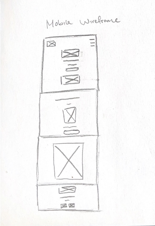
My Mobile Wireframe
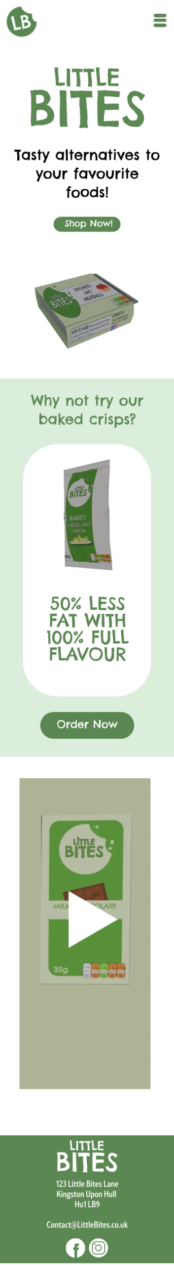
Lots of kids now use mobile devices more than laptops or computers, so I made a mobile version of the website to make the design responsive. I made another wireframe sketch and compressed the design by adding a hamburger menu for the navigation and stacking elements vertically. This is because there isn’t as much space going across the screen, so things have to become stacked to fit. I changed the alignment of most of the design to be centered to keep everything fitting on screen, such as the footer. The footer is now all stacked instead of the links been to the right and text to the left. I made images and text sizes smaller to fit the mobile screens better because the size of the website design would be too big on mobile.
Little Bites mobile website
“Responsive design can help you solve a lot of problems for your website. It will make your site mobile-friendly, improve the way it looks on devices with both large and small screens, and increase the amount of time that visitors spend on your site. It can also help you improve your rankings in search engines.” (WebFX, ND)
A responsive website makes it easier for users to navigate, and they then spend more time browsing, which will make them more likely to buy the products.
Reference List:
WebFX (nd) Why is Responsive Design So Important? [Quote]. Available online: Why is Responsive Design So Important? [Accessed: 12/04/2025]
As a part of my project, I created some posters to promote my brand’s products. Before I started to design my posters, I looked at promotional poster designs from other companies to see what works for them and to inspire my designs too.
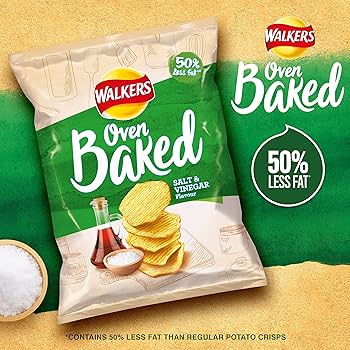
Walkers Baked poster advert
I looked at Walkers crisps and found a design which is quite simple yet effective. This is for their oven baked line and shows the product in the centre left of the design taking up most of the space and drawing your attention there first. There is the brands logo to the side which is also large because it makes you recognise the company, who are very well known. There is a tagline which says ‘50% less fat’, which makes the product more appealing to people who are health conscious. The colours used are matching the salt and vinegar flavour and match the design of the crisp packet, with a green diagonal stripe across a textured beige background. There is also a small bowl of salt to show the ingredients in the product which makes them feel less processed and more natural. I also noticed a small disclaimer text for the ‘50% less fat’ tagline to say that the product has 50% less fat than normal crisps. When I looked at this further, I found out that it is a legal requirement to avoid misleading consumers.
“Besides avoiding civil court proceedings against the Federal Trade Commission, advertising disclaimers also protect your business by removing legal liability surrounding a customer’s purchase. In other words, they tell a customer you’re not responsible for making them buy the product.” (Crawford, 2024)
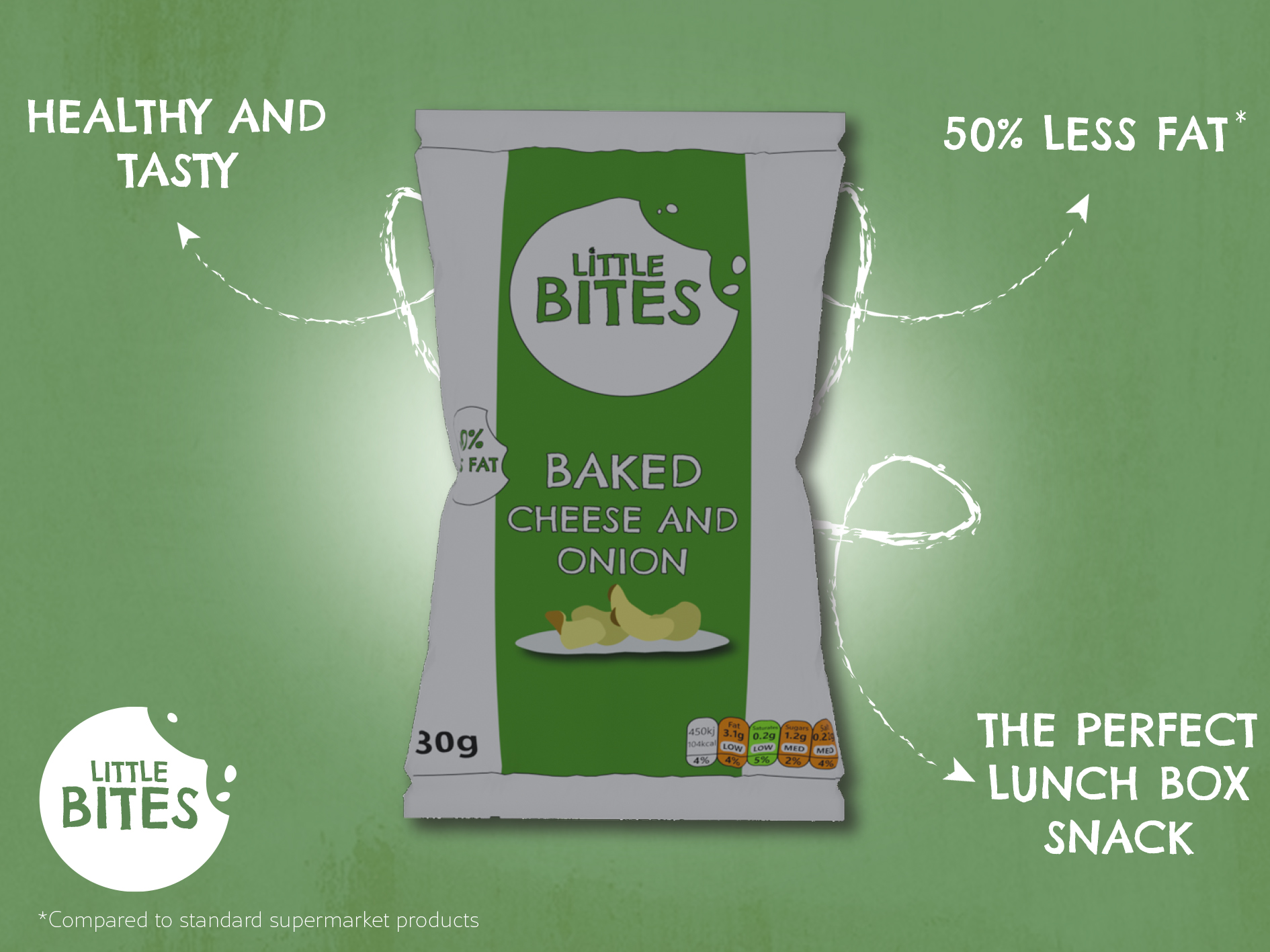
Poster I made for my crisp product
For my own design, I was inspired by Walkers because of the simplicity and how the poster was straight to the point. I decided to make the crisp packet be in the centre of the poster against a green backdrop, and I added a white circle behind the packet which I blurred to make it look like it was spotlighting the crisps to draw your attention in. To make this effect stronger, I added a darker green to the edge of the design and blurred it for a vignette look which made the brighter areas contrast more.I also used a drop shadow to make the crisps stand out more in the foreground and to feel less flat. For the outside of the design, I added arrows which pointed in to the product and highlighted things such as them being perfect for lunchboxes and that they were low in fat. Like Walkers, I made sure to add a smaller disclaimer to say ‘compared to other supermarket brands’ to avoid being misleading. For text, I used the Chelsea Market Pro font to connect with the brand identity, and I used a scratchier brush style for the arrows to add texture and make the design feel hand drawn. I then added the brand logo and a free texture over the entire design to add a rustic feeling which makes the product come off as natural.
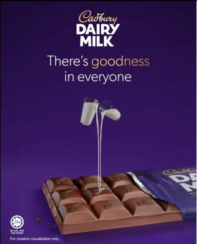
Cadbury chocolate poster ad
I also looked at Cadbury posters and saw that they too used simple designs which put the attention more on the product with a tagline and the logo. They have also used vignette effects to bring attention to the middle where the product is and they show the bar of chocolate unwrapped to reveal the inside.
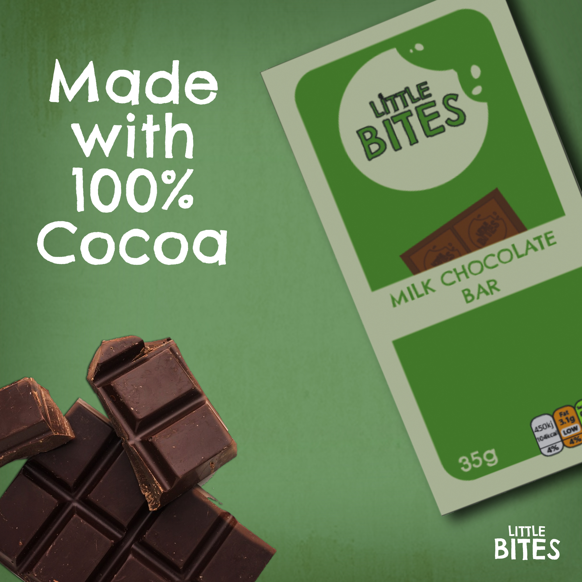
Poster I made for my chocolate bar
I made my own advert for the chocolate, starting with the background which I used the same style as before by adding the same texture because I wanted the posters to be recognisable as the Little Bites brand. I used an image of my chocolate bar and placed it off to the right at an angle, which left space for me to add a free image I found of a bar of chocolate. I put the chocolate at the bottom left to balance out the large space the product took in the top right. I then added some text saying ‘made with 100% cocoa’ above the chocolate and the logo in the bottom right. I used the text logo instead of the icon because it fit in the space better since it was more horizontal and matched the angles in the design.
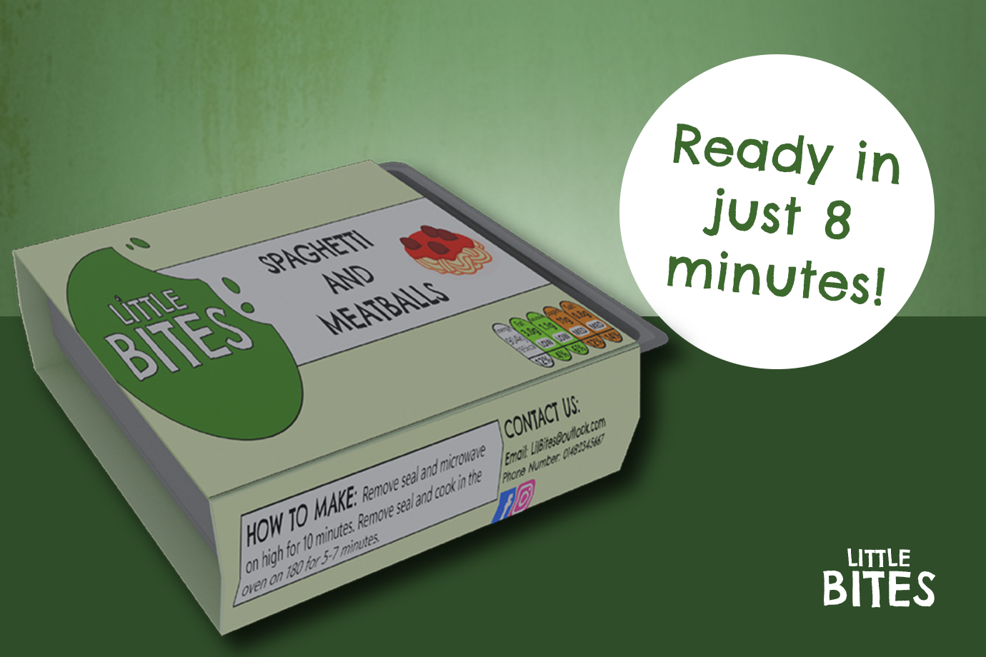
Poster I made for my ready meal
The last poster I made was for the ready meal product and I wanted to show how quick and easy it is to prepare for parents who are short on time but want to provide a tasty meal for their children. I created a landscape design and used a darker green on the bottom half to create a surface for the ready meal to sit on. I kept the texture on the top half and added a white circle to bring attention to some text which says ‘ready in just 8 minutes!’ emphasising how easy it is to prepare the meal in a rush. I added the logo to the bottom right corner and made the ready meal quite large to showcase the product and bring the focus to this part of the design.
Reference List:
Cadbury (2020) Cadbury there’s goodness in everyone [Image]. Available online: https://www.minimeinsights.com/2020/09/12/cadbury-dairy-milk-celebrates-the-goodness-of-everyone/ [Accessed: 03/04/2025]
Crawford, Jason (2024) Advertising Disclaimer That Helps You Stay Compliant and Protected [Quote]. Available online: https://www.websitepolicies.com/blog/advertising-disclaimer#:~:text=Besides%20avoiding%20civil%20court%20proceedings,making%20them%20buy%20the%20product. [Accessed: 03/04/2025]
Efe_Madrid (nd) White and brown watercolour texture [Image]. Available online: https://www.freepik.com/free-photo/white-brown-watercolor-texture_7391285.htm#fromView=keyword&page=1&position=17&uuid=9053685f-bd0c-4d76-8361-cf3182087a3d&query=Rustic+Texture [Accessed: 03/04/2025]
Walkers (2025) Walkers Oven Baked Salt and Vinegar Crisps [Image]. Available online: https://m.media-amazon.com/images/I/A1mVBpRD4KL._AC_UF350,350_QL80_.jpg [Accessed: 03/04/2025]
After I finished creating my 3D models in Blender, I moved on to creating my animation showcasing the products. To start with, I first looked at some food animations for inspiration.
The first animation I looked at was this one for a bakery. This animation uses close shots of both the food and the packaging in fun and dynamic ways such as with the cookie popping up and repeating, or the seal being ripped off quickly. The audio used is upbeat and adds to the fun feeling of the animation. The animation also shows the cookies being crumbled up and broken into, with sound effects to show how crunchy the cookies are. At the end, there is a final shot of the full product and text appears saying ‘available in three flavours’, this makes the product more appealing to a larger audience who might want to try some of the other products.
The second animation was for a drinks company. This animation uses fast paced shots and shows the different flavours of the drink with the matching colour of the drink in the background which makes each flavour stand out. Then the ingredients fly up around the cans and the drinks are shown being poured into a glass. This animation is very fast paced and energised, and the music matches well as it also feels fast. There are extra sound effects when the drinks are poured to make it sound as if the music is playing under water which adds a fun touch and attention to detail in the animation.
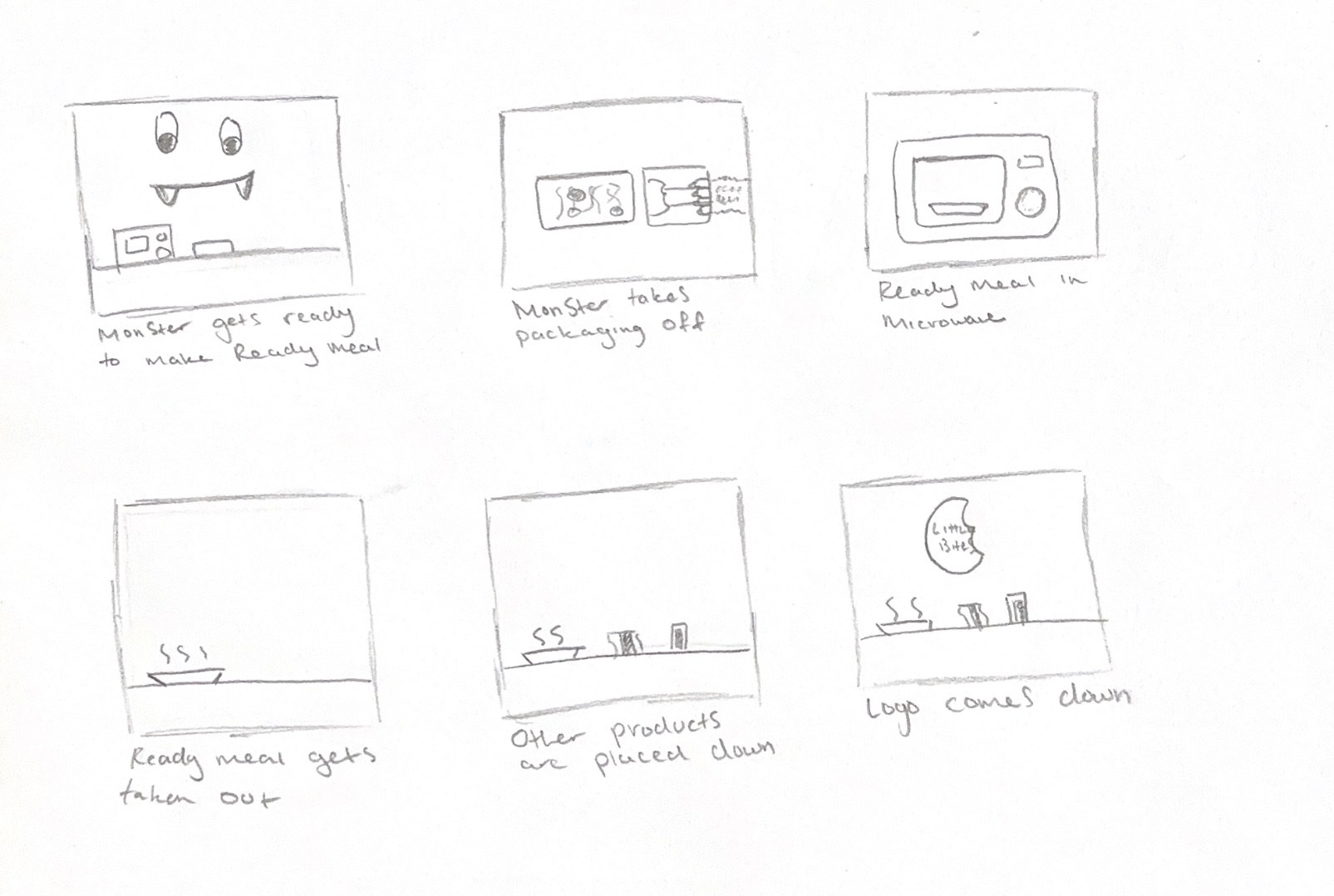
My original Storyboard for my animation
I then made my own animation storyboard. This was my first storyboard, showing a monster character preparing the ready meal in the microwave, taking it out of the packaging and dishing it up. I initially wanted to use the character to appeal more to children, but I ended up abandoning this idea when I realised that it would require me to not only learn 3D character design, but to learn how to set up and rig the character’s limbs to make it move. The monster character had also not appeared anywhere else in my brand, and it felt disconnected to the rest of it.
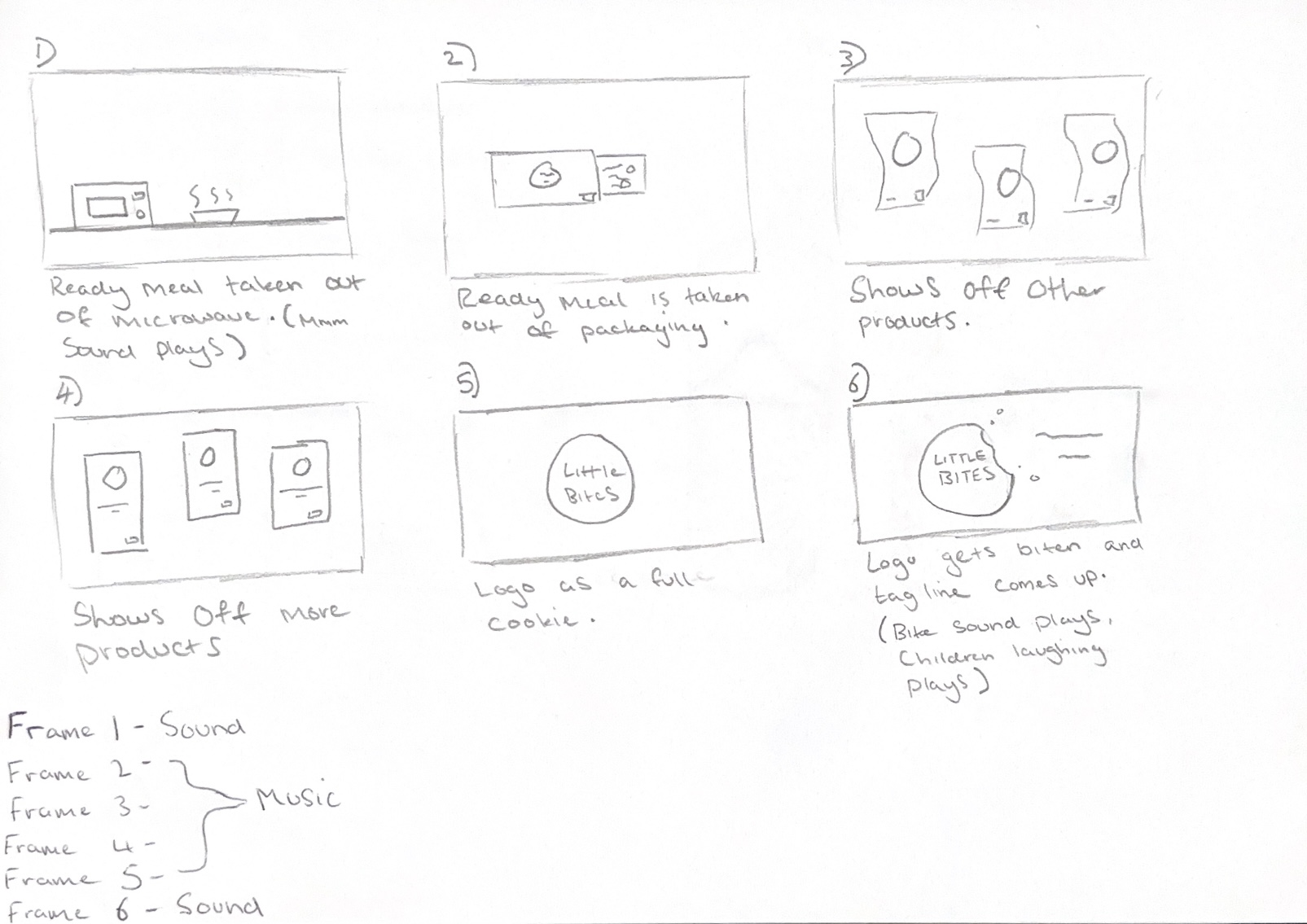
Second animation storyboard
I instead chose a simplified storyboard design, where the ready meal is shown being prepared in the microwave and then the animation switches to also show the other products through dynamic shots which add energy and excitement. At the end, all the products are shown together, and the logo appears over the final frame.
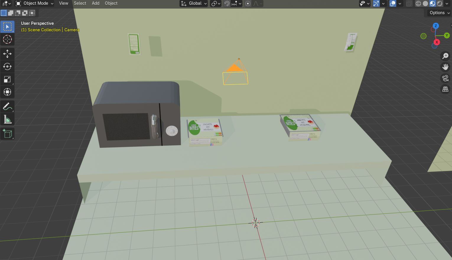
Setting up the animation scene
Once I had my storyboard completed, I started to set up a kitchen scene and modelled some items to go in it, such as a worktop, a wall and a microwave. I added my camera set up and some basic lights, but I also used a studio HDRI from Polyhaven to create a more even lighting set up and some smaller spotlights to draw more attention to focal points within the scene.
With the scene now set up, I started to keyframe and move the models within the scene to match what happens in my storyboard. The animation was set to 24fps but my first renderdidn’t go as planned because I didn’t take this into consideration, so the first version was only 5 seconds long and was too short. I went back and moved all my keyframes over so that the animation lasted longer, with the animation now being 10 seconds long. To render the animation, I used the render engine called EEVEE which is not only faster at rendering but is more stylised and suited for an animation for a brand aimed towards children. Thecycles engine takes longer to render because it uses more accurate lighting settings to render materials more realistically, but my animation didn’t need to be as realistic sinceit is more playful. I rendered the animation as a PNG sequence rather than a video sequence because I didn’t want Blender to crash during the render process and lose progress, forcing me to start again. Rendering as an image sequence means that if the program crashes, you can just continue again from the frame you were last on.
Then I brought the PNGs into Premiere Pro and used the import as image sequence tool to turn the frames into an animation. I wanted to add text and sound, so I exported the animation as an MP4 and moved it to Adobe Express to easily add text and sound from their free sound library. For the audio, I chose a track called ‘Happy Kids’ which was upbeat and suitable for a children’s animation. I also brought my logo in as a PNG overlay as well as a modified version of the logo but with a full cookie shape because I wanted to create a playful effect by having the cookie be bitten into at the end as a way of adding personality to the animation. For the crunching sound effect, I used another sound from Adobe Express of a crunch noise.
When I started to make my 3D packaging models, I first looked at existing products and their design so I could understand how they are put together and I could see the details of their shapes.
Ready Meal Front View
Ready Meal Open View
Ready Meal Side View
Ready Meal Back View
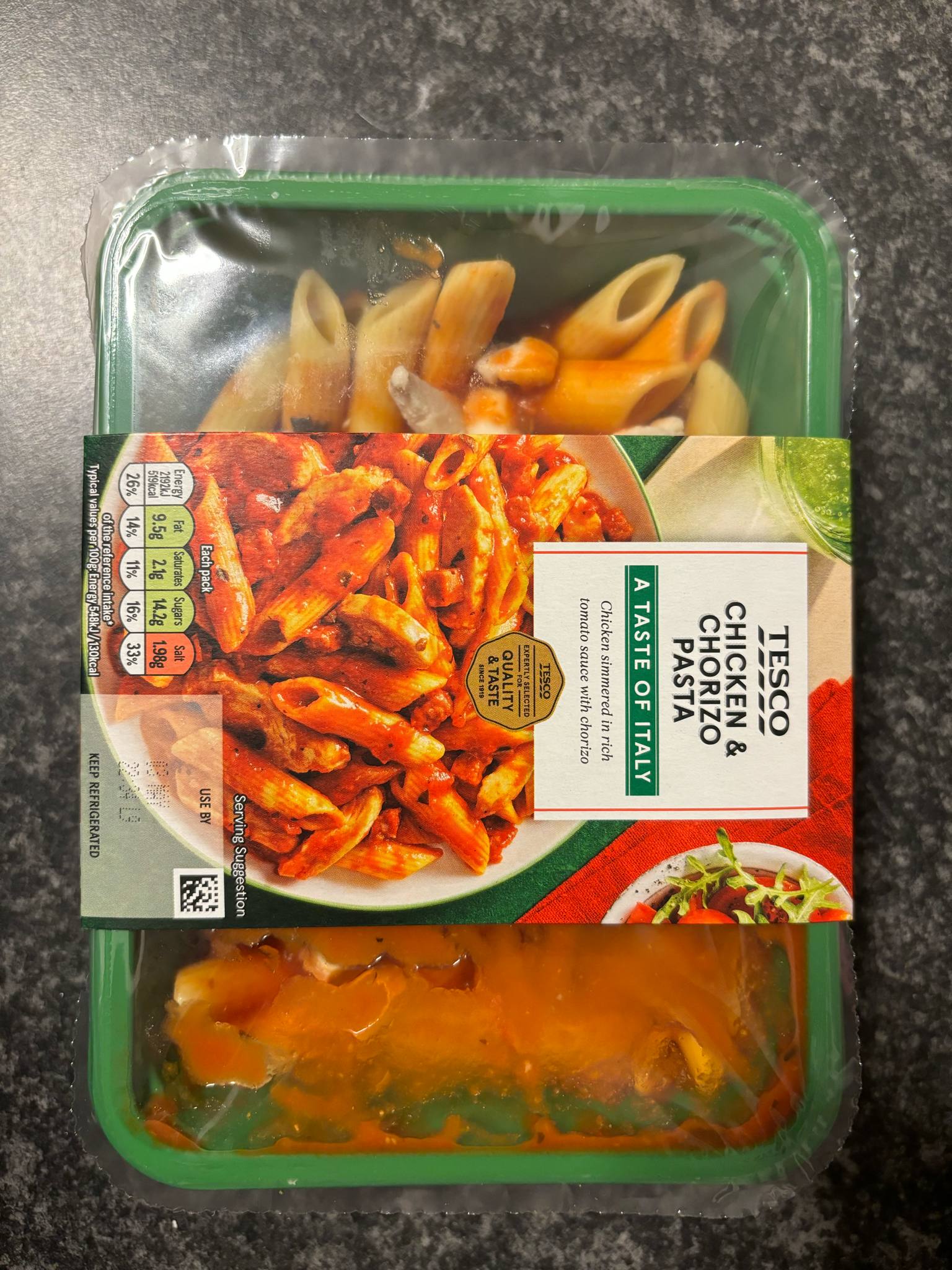
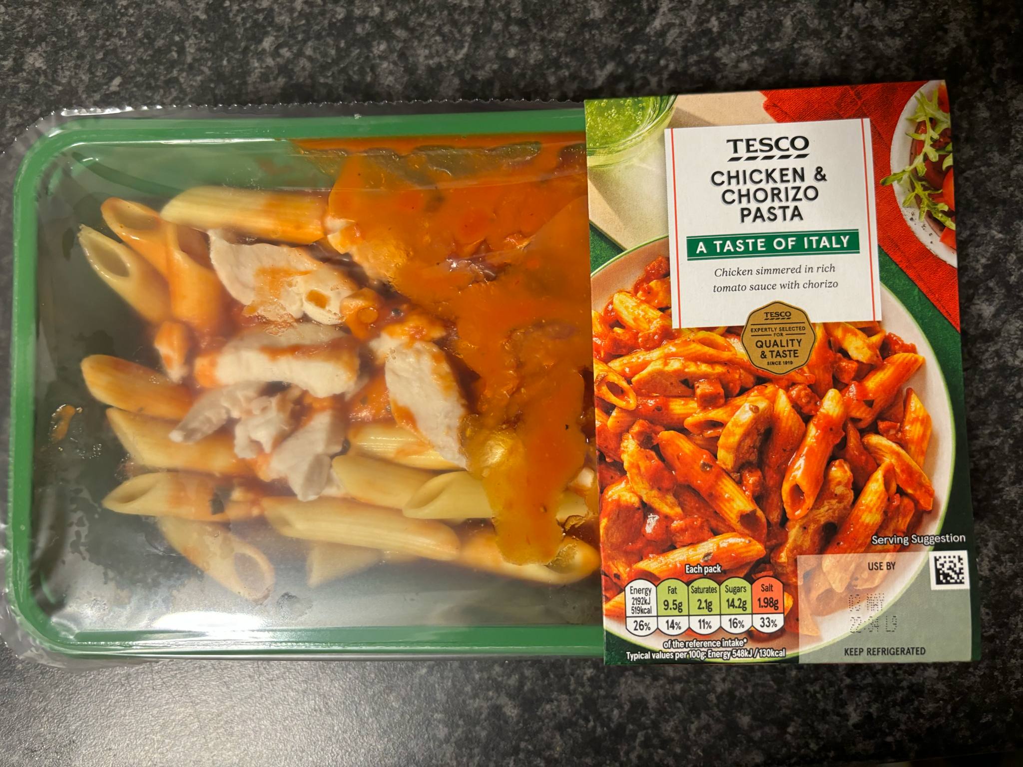
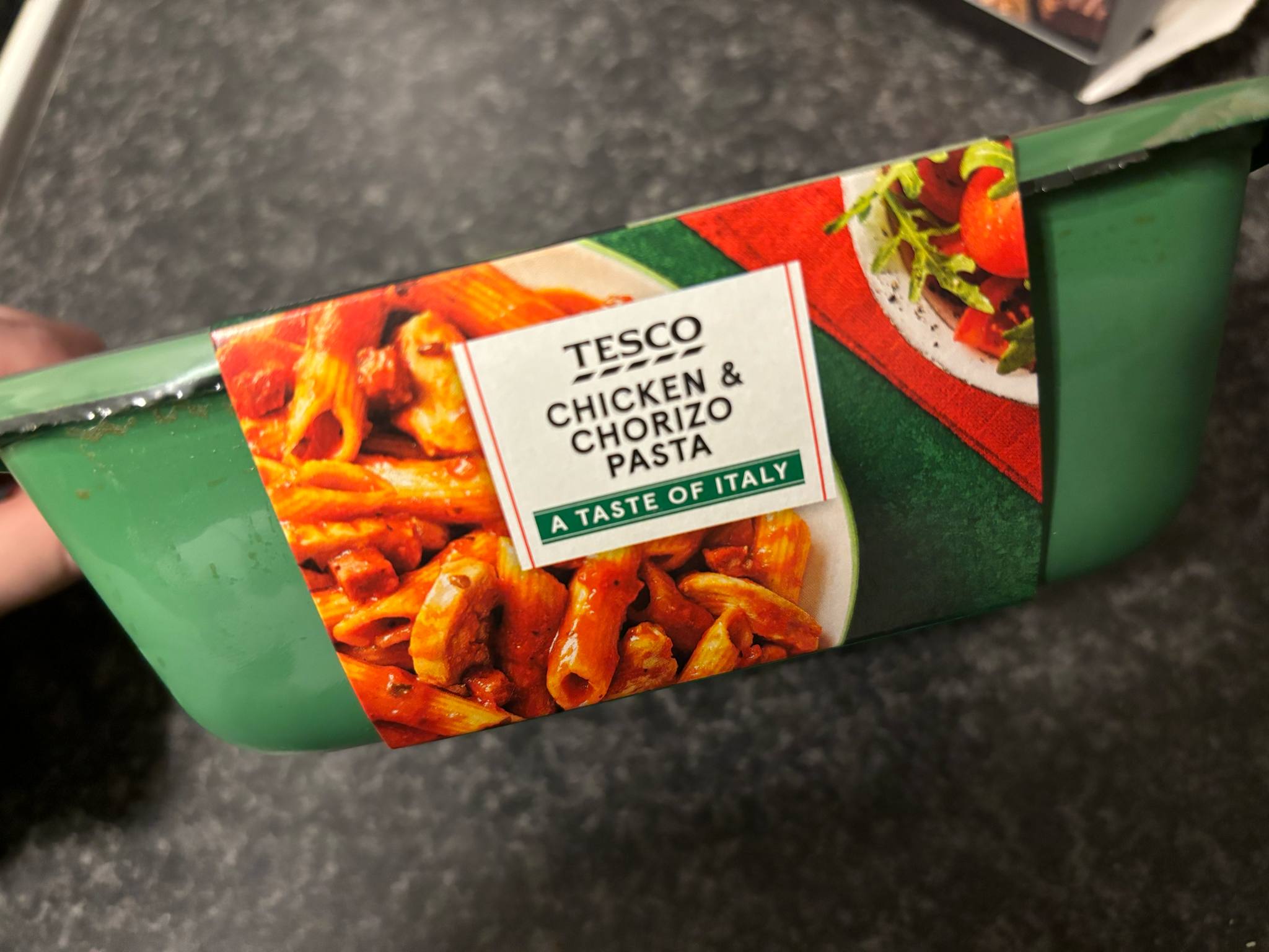
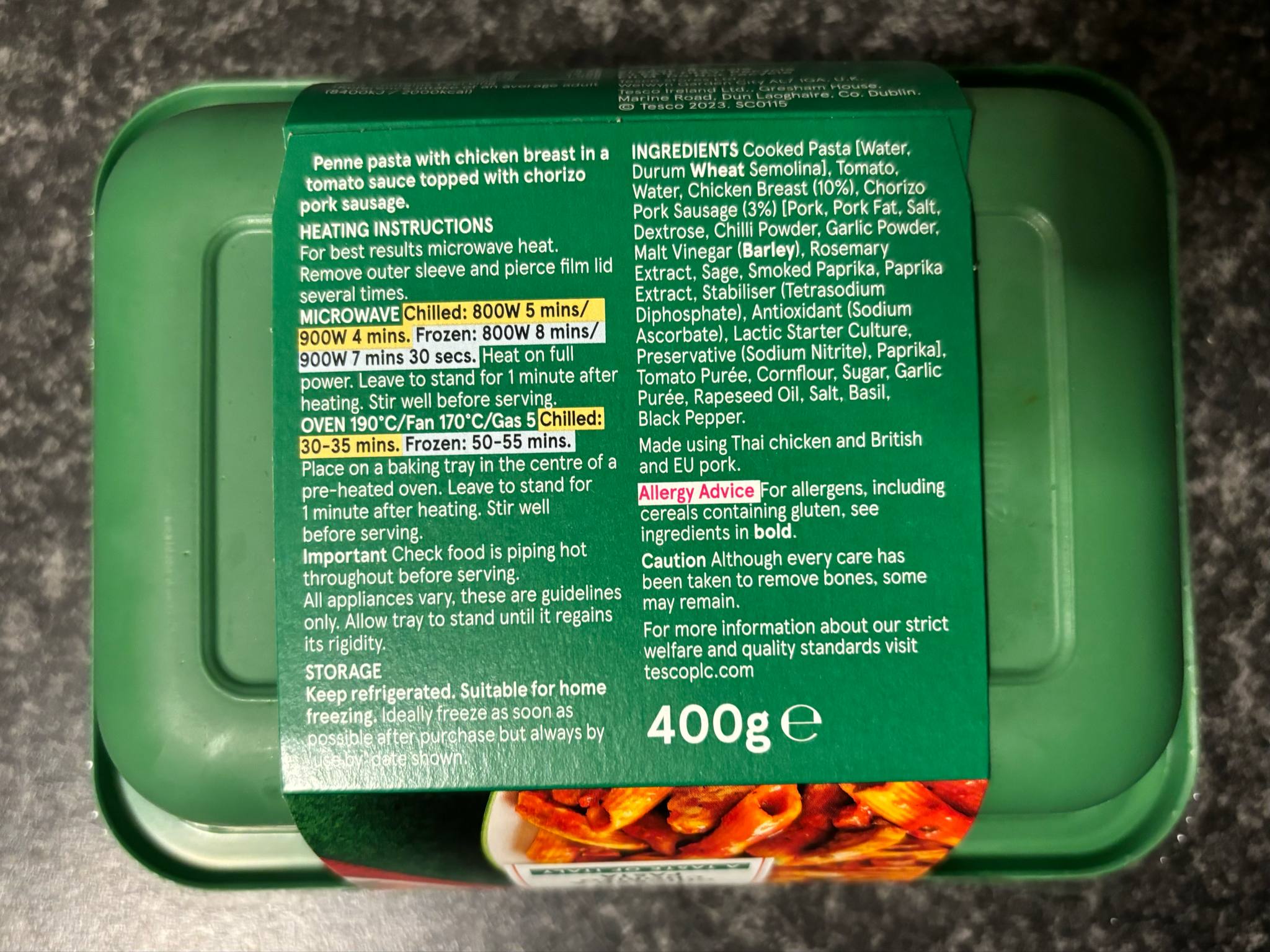
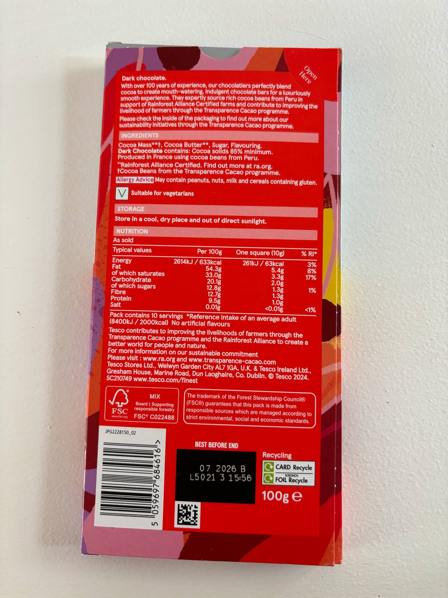
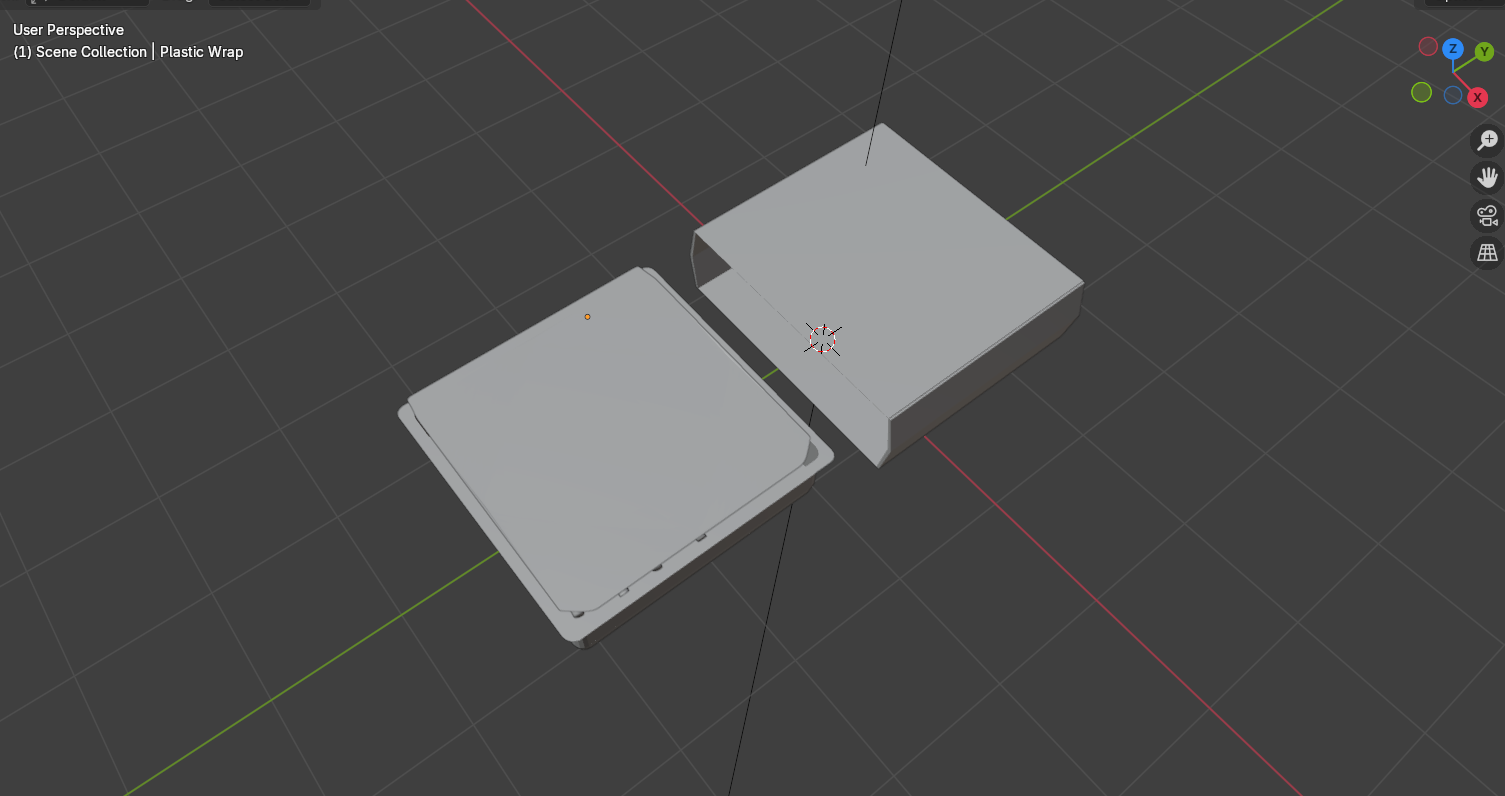
I first took some photographs of a ready meal packaging and observed different angles to see the shape of the box and how it is assembled. These ready meals come in a plastic rectangular tray which is sealed with a clear plastic sheet that has a tab where you can easily pull it off. The trays don’t have any designs on them and are a plain colour which compliments the outer sleeve. The outer sleeve is made of paper or cardboard, so it is easy to recycle, and it displays all the information about the ready meal, such as what it is, the nutritional values, the brand and the preparation instructions. I noticed that the outer sleeve joins at the sides where there is a fold seam which makes the packaging more flexible and easier to slide on and off. This design is more user friendly because it makes it easier to get into the product and the food being ready to eat from the tray reduces mess and time spent doing dishes. This makes it more convenient for parents who are in a rush or just want to relax after working all day.
Crisps Front View
Crisps Back View
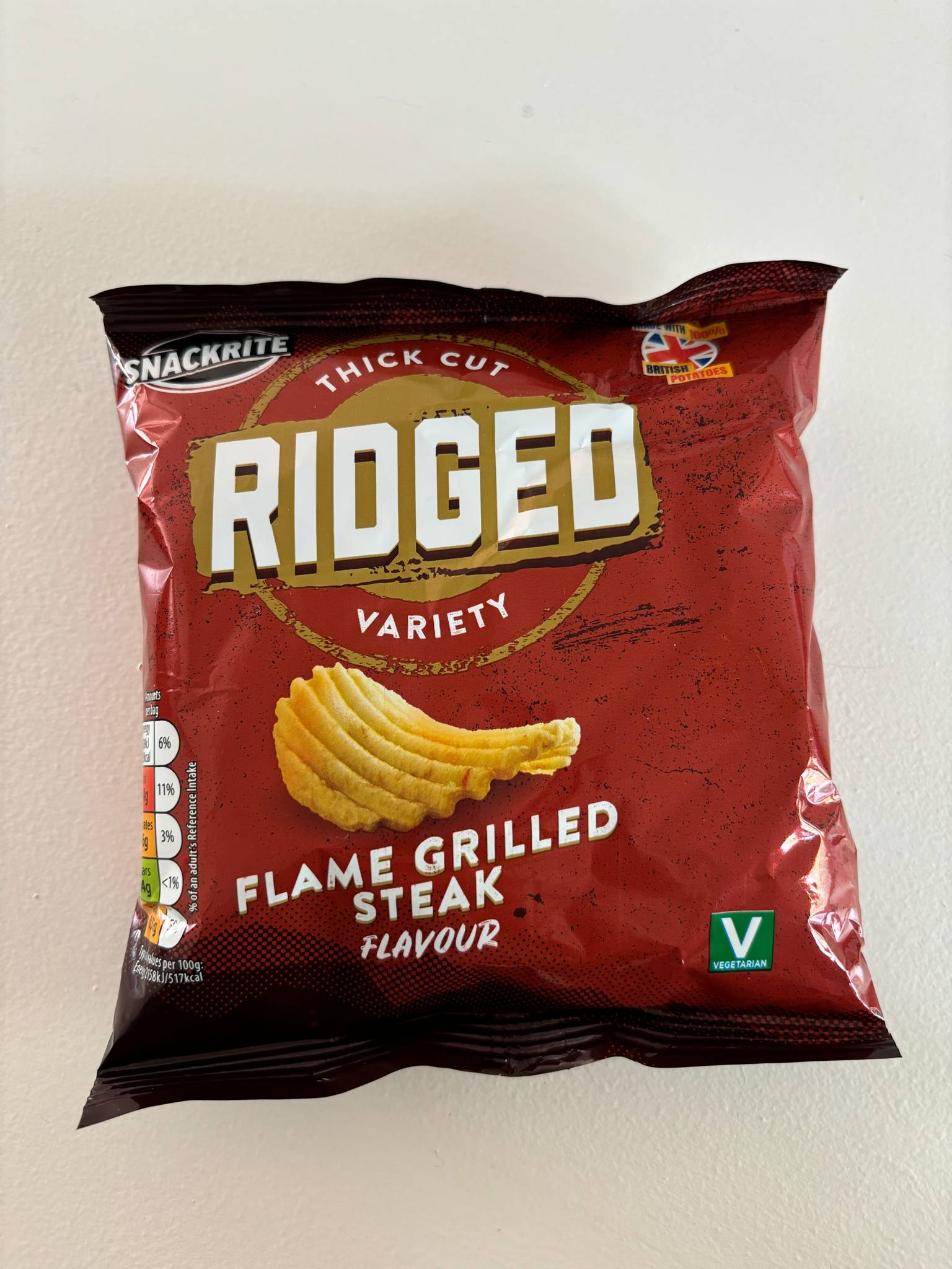
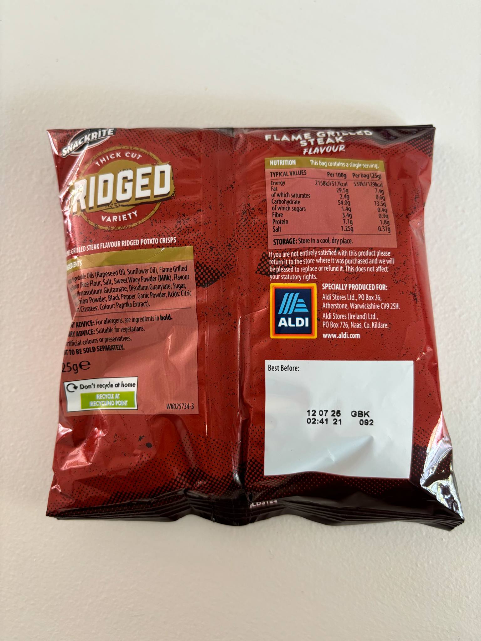
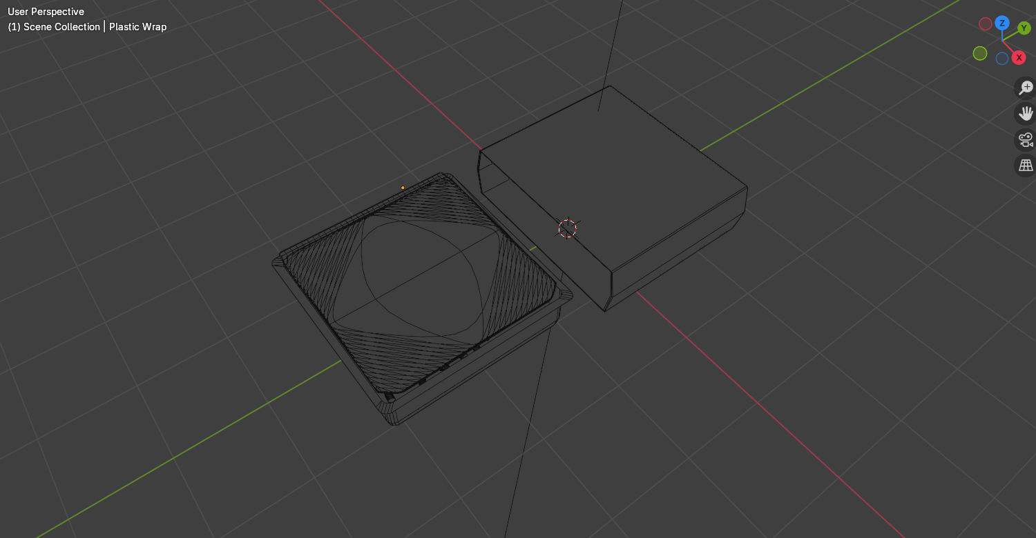
I then looked at a packet of crisps. Crisp packets are all very similar to each other, but I wanted to look at how the packaging comes together so I could model it easier. Crisp packets are naturally creased and are stuffed out due to the crisps inside. They have a seal at the top and bottom of the packet which is flat and has lines on where the two sides have been pressed together.
Chocolate Bar Front View
Chocolate Bar Side View
Chocolate Bar Back View
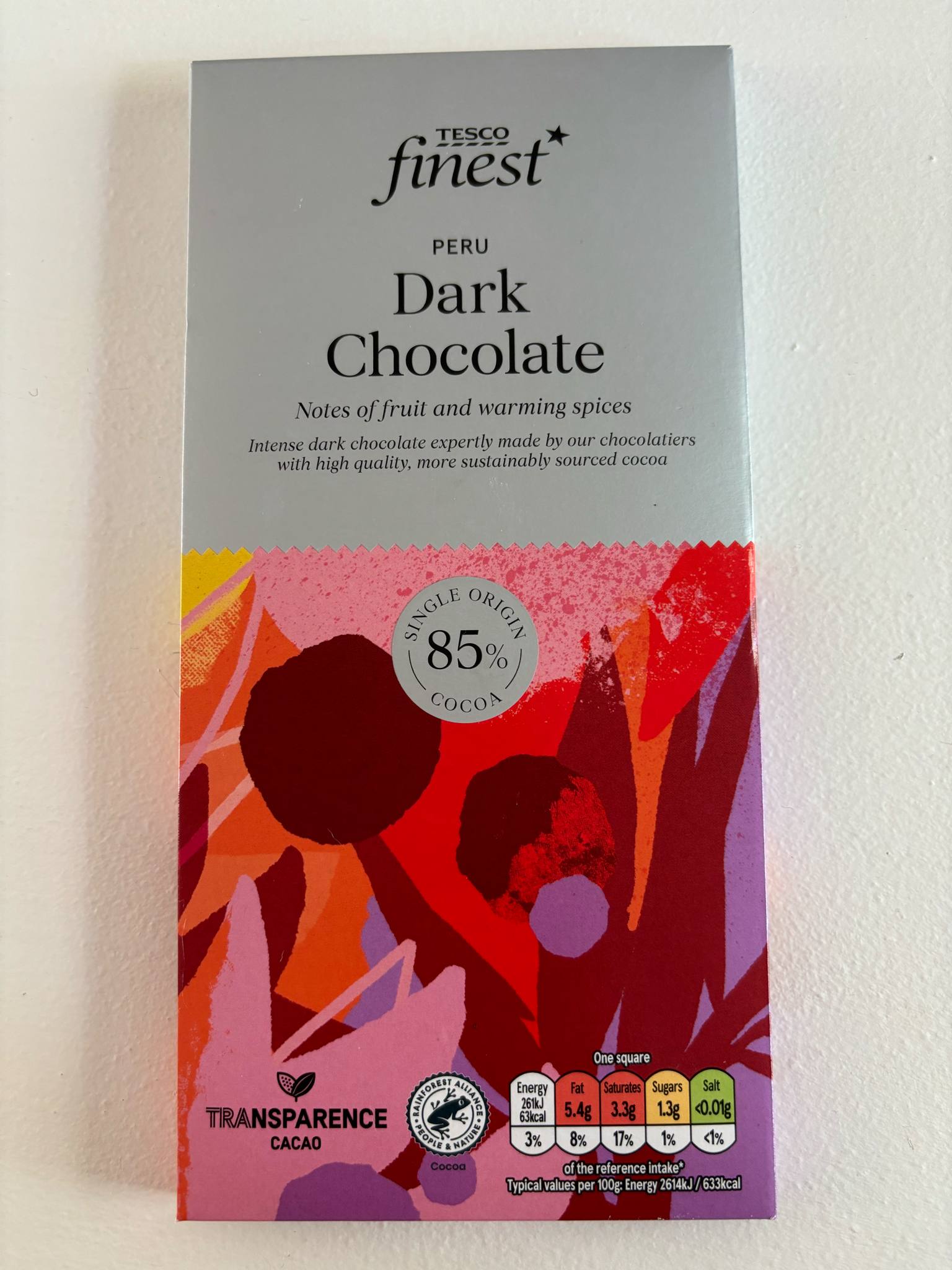
Then I looked at a chocolate bar packaging. This chocolate bar comes in a paper packaging which is more environmentally friendly than plastic wrappers and easier for children to unwrap. There is an area where you can press your thumb down and open the packet to access the chocolate, making it easier to slide the chocolate back in and reseal for later. Comparing this to brands such as Cadbury’s, who use plastic wrappers which don’t reseal as well, I think I would also like for my packaging to use paper since it is more friendly for young people to access and can be stored away easily with less mess.
Solid View of Ready Meal
Wireframe View of Ready Meal
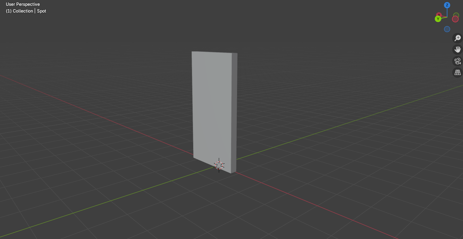
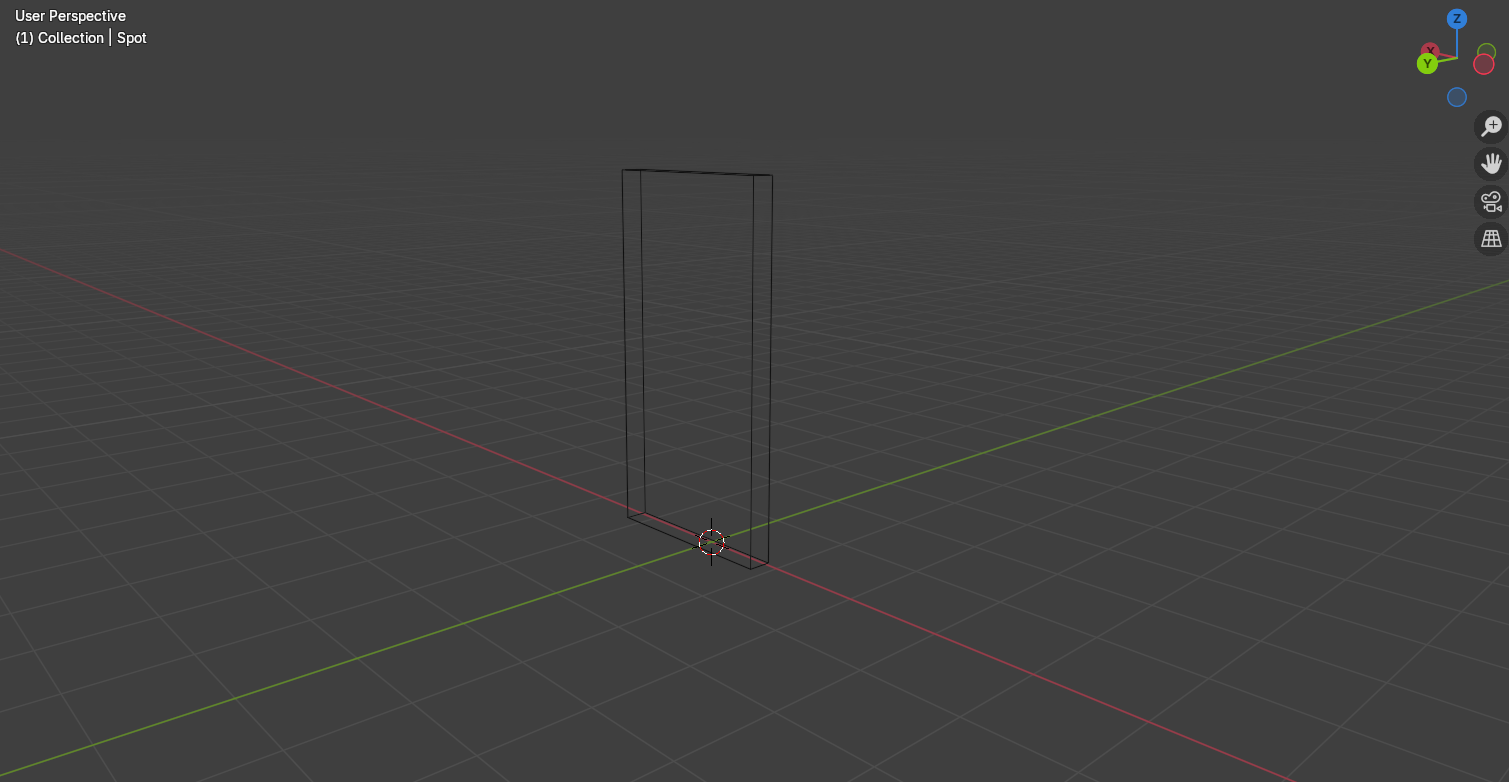
I started to make my packaging models in Blender and began with the ready meal. I found the ready meal quite straightforward because it was mostly rectangular and smooth. I bevelled the edges of the box so there wouldn’t be any sharp edges which could poke or scratch, which may be dangerous for young children when eating the meal. For the plastic seal I used a plane and scaled it down to be very thin. I placed it over the top of the tray and scaled it up so that the bottom right corner came over the tray slightly, making it easier to peel off. I joined the seal to the tray using ctrl+j so that the packaging could be moved together when I made an animation later on rather than having to move them both individually.
For the outer packaging, I added a cube and removed two of the outer faces so the inside was hollow. I scaled and resized the cube to fit around the tray and added loop cuts to create extra edges around the sides of the sleeve, which I moved out slightly to make the model less stiff, matching the slight bendiness of the ready meal packaging I had looked at for inspiration.
Solid View of Crisps Front
Solid View of Crisps Side
Wireframe View of Crisps Front
Wireframe View of Crisps Side
Tutorial I followed to make crisp packet creases.
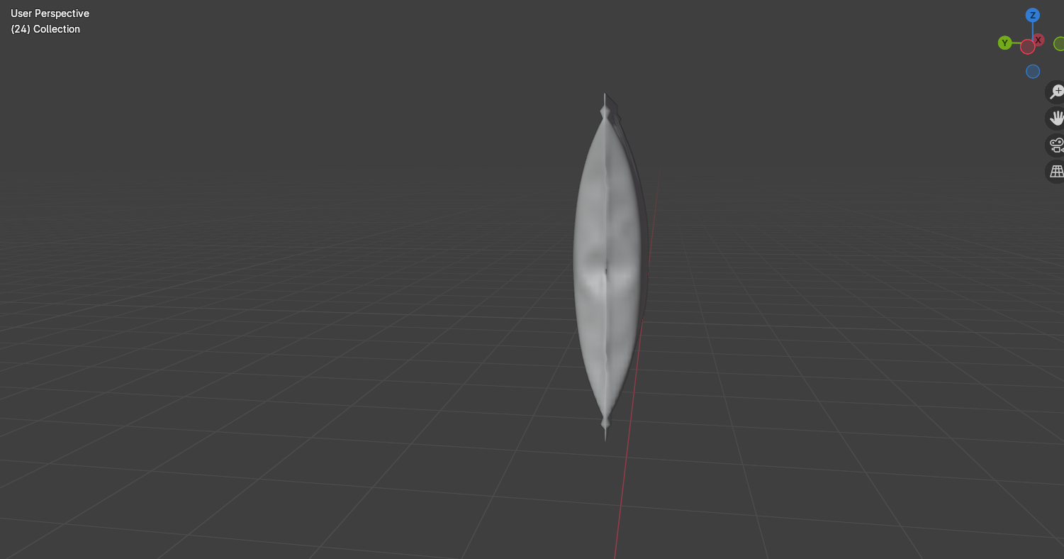
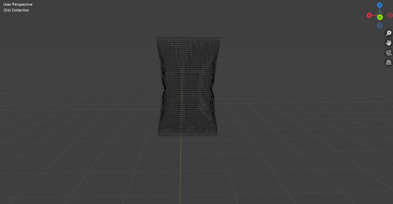
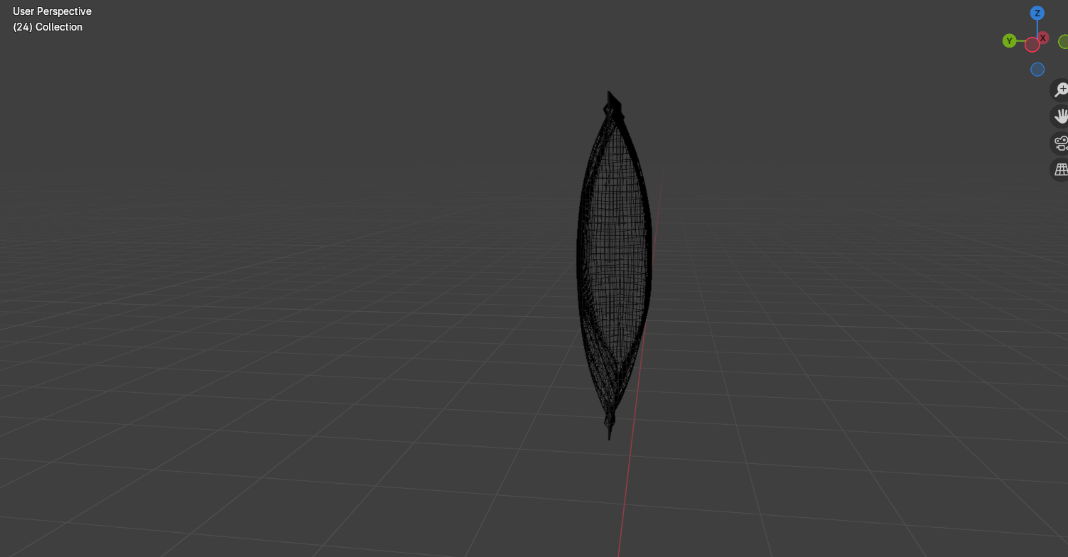
I then moved onto the crisps packet. This was the hardest to model because of the inflated effect in the middle. I had to look at some tutorials on how to inflate a model and found it frustrating the first few tries as it wasn’t giving me the results I wanted and kept over inflating. After changing the settings, I finally had an effect that I liked and was able to carry on adding details such as the creases. To make the creases, I sub divided the model into many small squares and group selected different areas and pushed them in and out, so it looked like the packet had small dips where creases had formed. Then I added the edges where the crisps sealed together by extruding the top and bottom edges to create a flat rectangle.
Solid View of Chocolate Bar
Wireframe View of Chocolate Bar
To make the chocolate bar, I used a single plane and used extrusions to create folds and to make the package take a rectangular shape. I did this instead of using a single rectangle because I wanted to create the overlapping parts instead of a solid single shape.
Material Settings for Plastic Tray
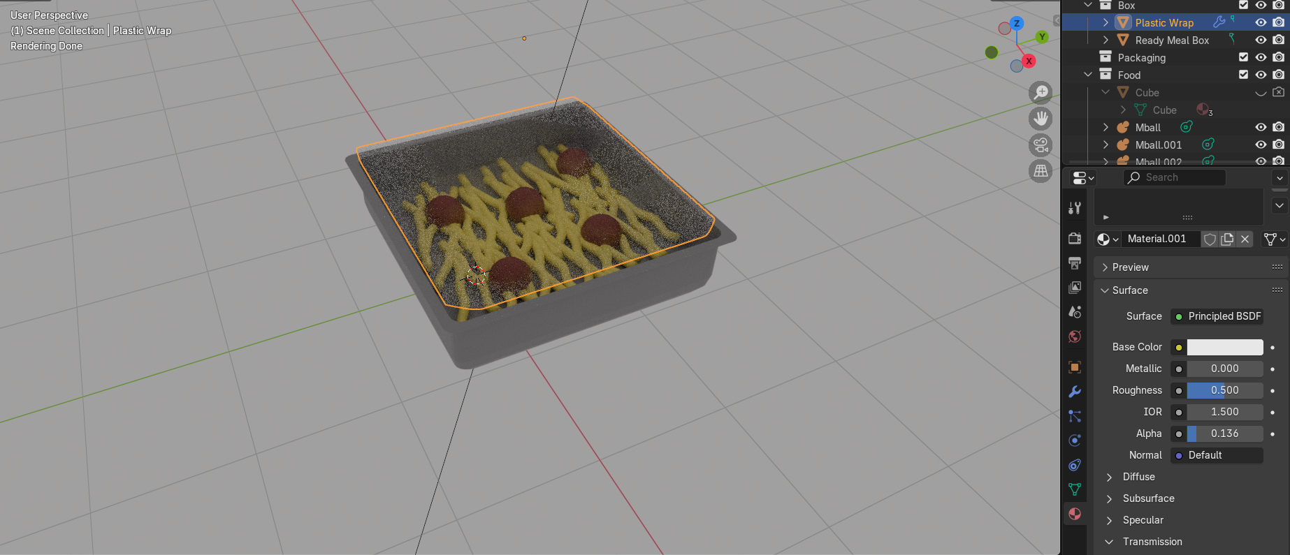
I then had to add textures to the models. I started with the basic textures such as the plastic tray design. I used a glossy material to make the plastic look shiny and a solid colour for the main tray. For the seal, I used a transparent shader and turned the opacity down so that it looked translucent and I turned the roughness down to add a slight shine to reflect light.
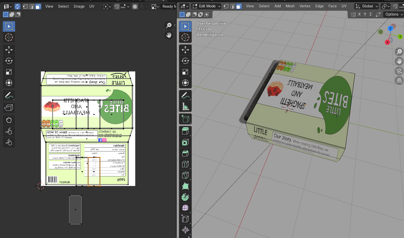
UV Unwrapping Packaging Design
For the rest of the packaging, I wanted to use my designs I had already made. This meant I had to UV unwrap the models and apply the designs on top. I clicked on the edges of my models and clicked mark seams to show where the stops in the packaging were, before pressing u+smart unwrap to create flat versions of the packaging which I was then able to lay over my designs to place them onto the packaging. I had an issue with the designs mirroring on one side of the models and found this frustrating as I wasn’t sure on how to fix this in Blender, so instead I went back to Illustrator, and I flipped the areas which were mirroring. When I brought them back into the UV editor, it fixed the problem, and the designs were correct.
On top of the UV’s, I also added some material adjustments such as turning the roughness down on the crisps to make them look shiny with a plastic coating. For the chocolate bar I kept the roughness higher, so the packaging was more matte and paper like.
Ready Meal Test Render Open
Ready Meal Test Render Side
Ready Meal Test Render Back
Crisps test render side and front
Crisps test render back
Chocolate Bar Test Render Front and Side
Chocolate Bar Test Render Back
I then made some renders of the models and captured them from different angles to make sure they look all right. I have used the EEVEE render cycle which is quicker but looks less realistic than Cycles. I have tested in EEVEE because I plan to use these models in an animation, which will be rendered in EEVEE for a more stylised and kid-friendly look.
Reference List:
BlenderVitals (2023) Create Chips in Blender in 1 Minute! [Video]. Available Online: Create Chips in Blender in 1 Minute! [Accessed: 06/03/2025]
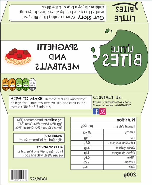
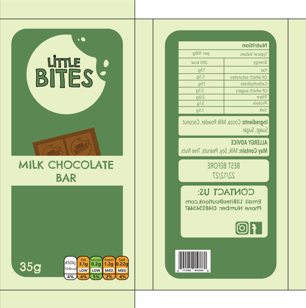
I am now going to start producing packaging designs for the food products in my brand.
The products that I have chosen for the food range are: A spaghetti and meatball ready meal, a milk chocolate bar and cheese and onion crisps.
I have chosen foods that are popular with children and decided to add a healthy spin by making them into nutritious alternatives that are just as tasty. The products are made with less sugars, salts and fats than other brands.
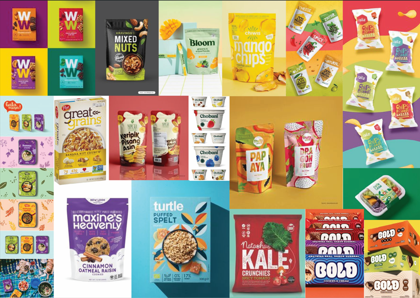
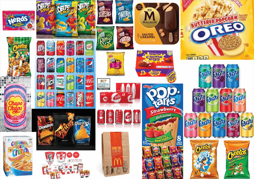
When creating my packaging designs, I looked at packaging for other healthy products like mine for inspiration. I found different examples of packaging designs and used them to create a mood board to generate ideas. I also did the same but for unhealthy food products and created another mood board so I could compare the both of them and look at what to avoid and what to include on my designs.
Healthy Mood Board
Unhealthy Mood Board
I noticed that a lot of packaging use various types of green as green is a colour associated with health and the unhealthy packaging would uses a lot of reds, orange and yellows. The healthy packaging would also use different types of items which would make you think of health, these were items like leaf’s, fruits and vegetables.
I also realised that a lot of healthier product packaging use various shades of green, a colour associated with health, as well as colours which look more organic and natural. In comparison, the unhealthier packaging used lots of bright and unnatural colours which were over saturated and as vibrant as possible. The healthier products focused on showing images or illustrations of the ingredients, such as fruits and vegetables, but the unhealthier ones tended to have more characters or cartoonish illustrations on them.
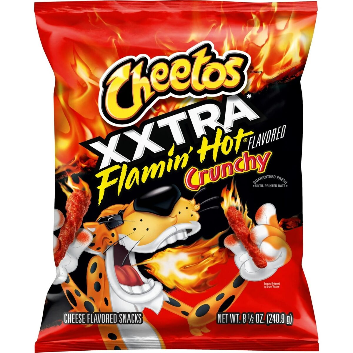
Cheetos packet
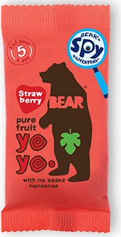
Bear YoYo packet
To compare these, I have looked at the Cheeto’s packaging in comparison to the Bear Yoyo packaging. Cheeto’s are an unhealthy snack which features a cartoon tiger character wearing sunglasses, which children may see as cool or fun. Bear Yoyo are a healthier brand who’s packaging says ‘1 of your 5 a day’ on which tells you instantly it is the better option. Their mascot is a shaded bear figure which is simplified and less stylised, which feels more calmer compared to the Cheeto tiger who comes across as more excited. The colours on the Cheeto’s are very strong and intense and their typography is more dramatic. The colours on the Bear Yoyo are also bright but are less saturated and the typography feels more hand drawn and friendly.
Research says that colour psychology plays a big role in food marketing and that fast food brands use colour combinations which convey excitement and hunger, such as reds and yellows. Green and yellow combinations are viewed as organic and fresh, and blues and whites suggest cleanliness and purity. (Athreya, nd)
The greens and images of healthy ingredients were two things I wanted to bring to my packaging. I wanted to use the same greens from my branding to keep things consistent and I wanted illustrations of the products to be on the packaging so customers knew exactly what they were buying. It was also important that the logo would be on the packaging and be very large and visible.
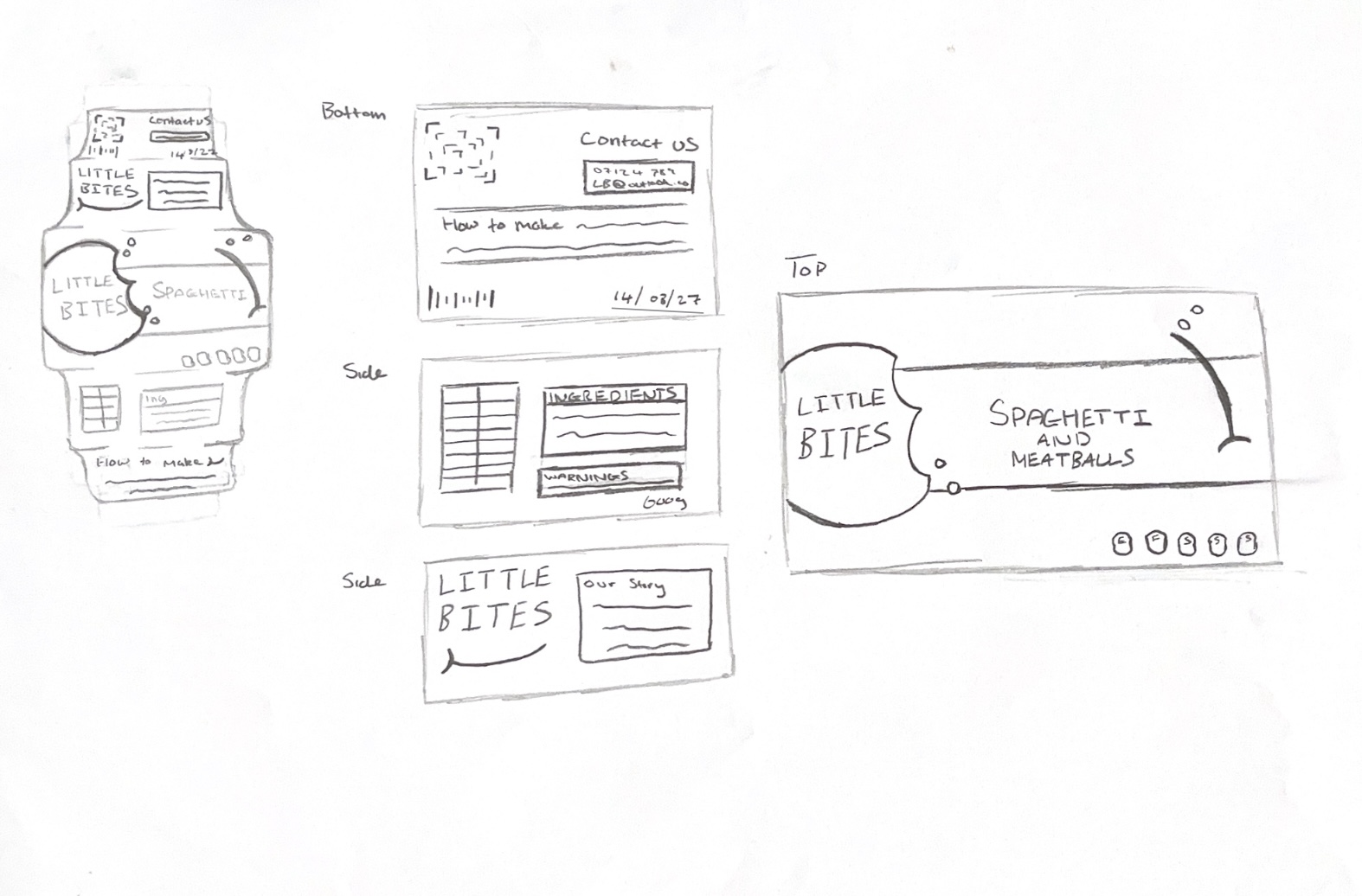
Ready Meal Sketches
Ready Meal Flat Packaging
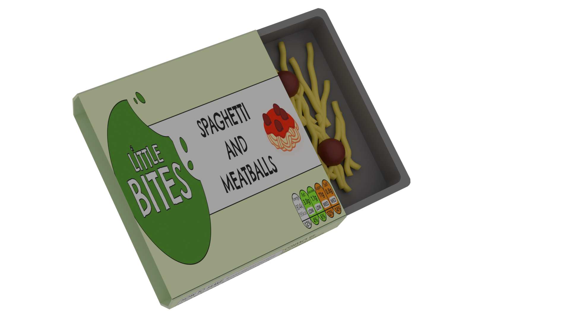
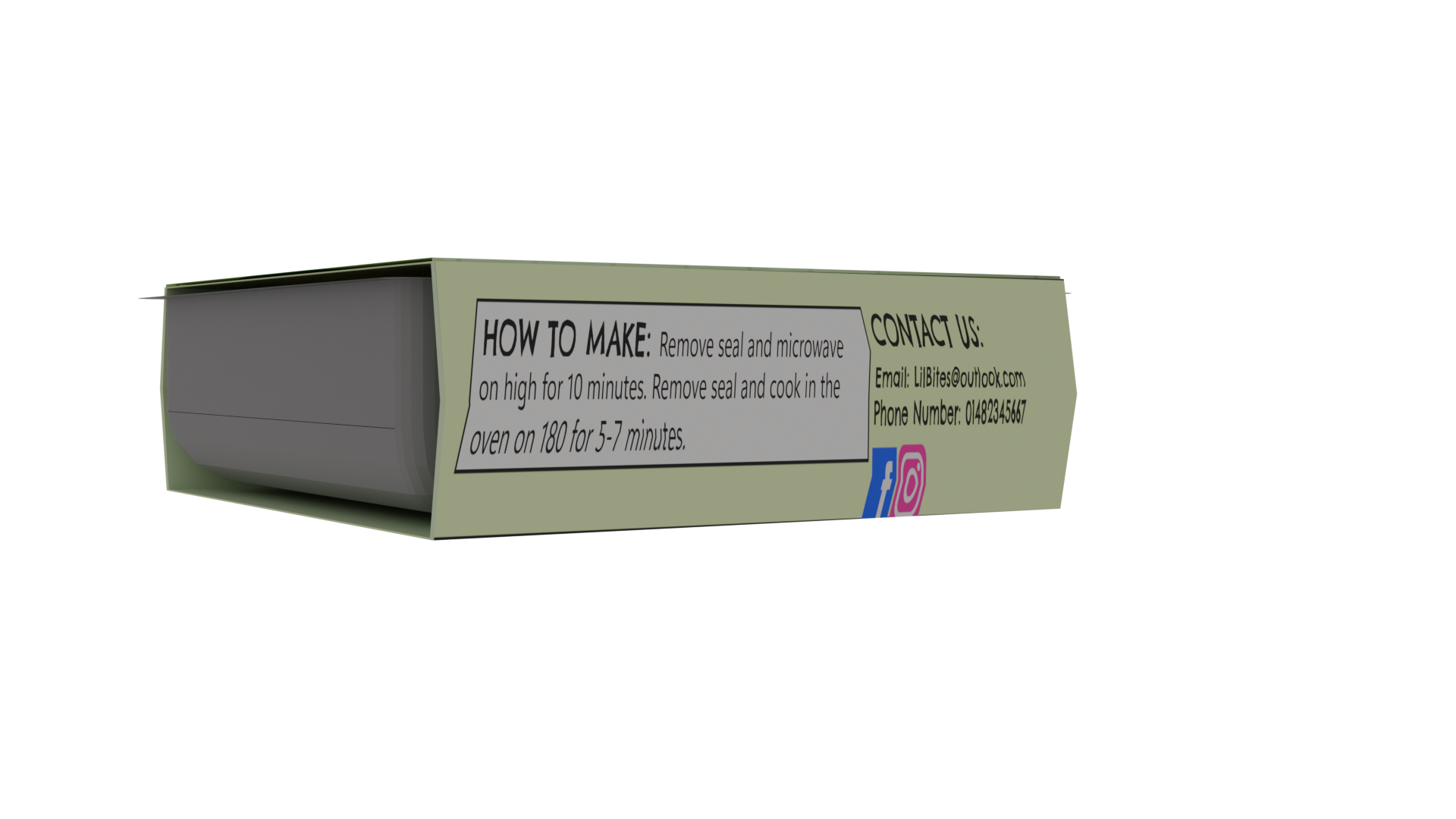
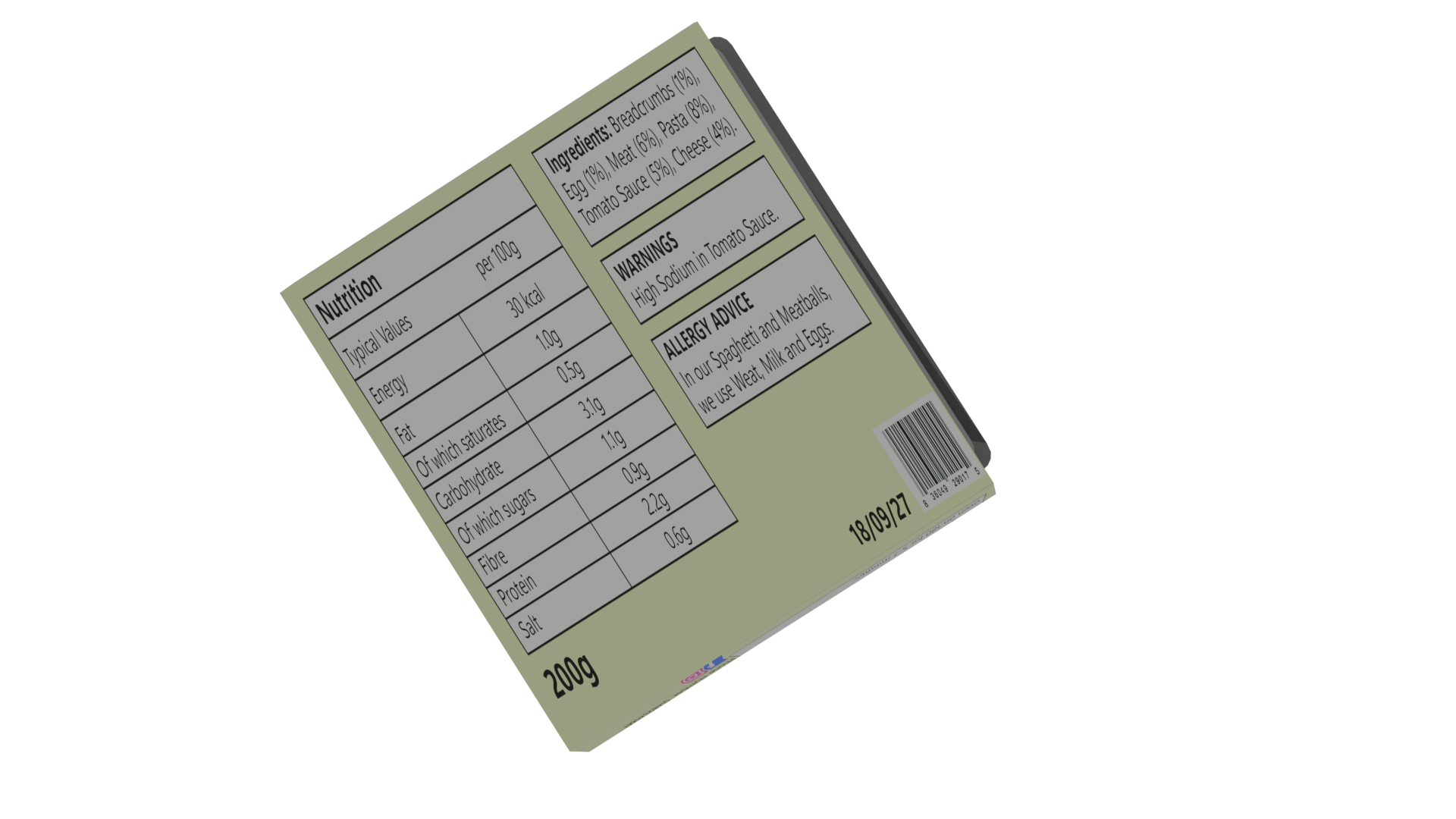
I began with the packaging for the ready meal. I started with a sketch to decide on the layout, covering the top, bottom and the sides. I wanted the package to be a carboard sleeve which slides over the plastic tray containing the food. For the top, I used the most important information such as the logo, the name of the product and an illustration to show what it is. I also included nutritional information such as the fat, sugars and calories, using the traffic light system to show that each category was healthy. The bottom included most of the text about the ingredients, warnings and more detailed nutritional facts. On the side is information about preparing the meal, contact information and some information about the Little Bites company.
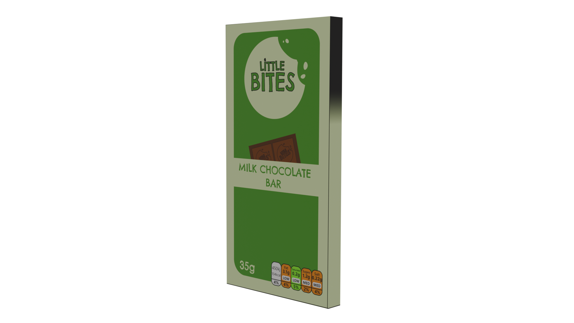
Chocolate Bar Sketches
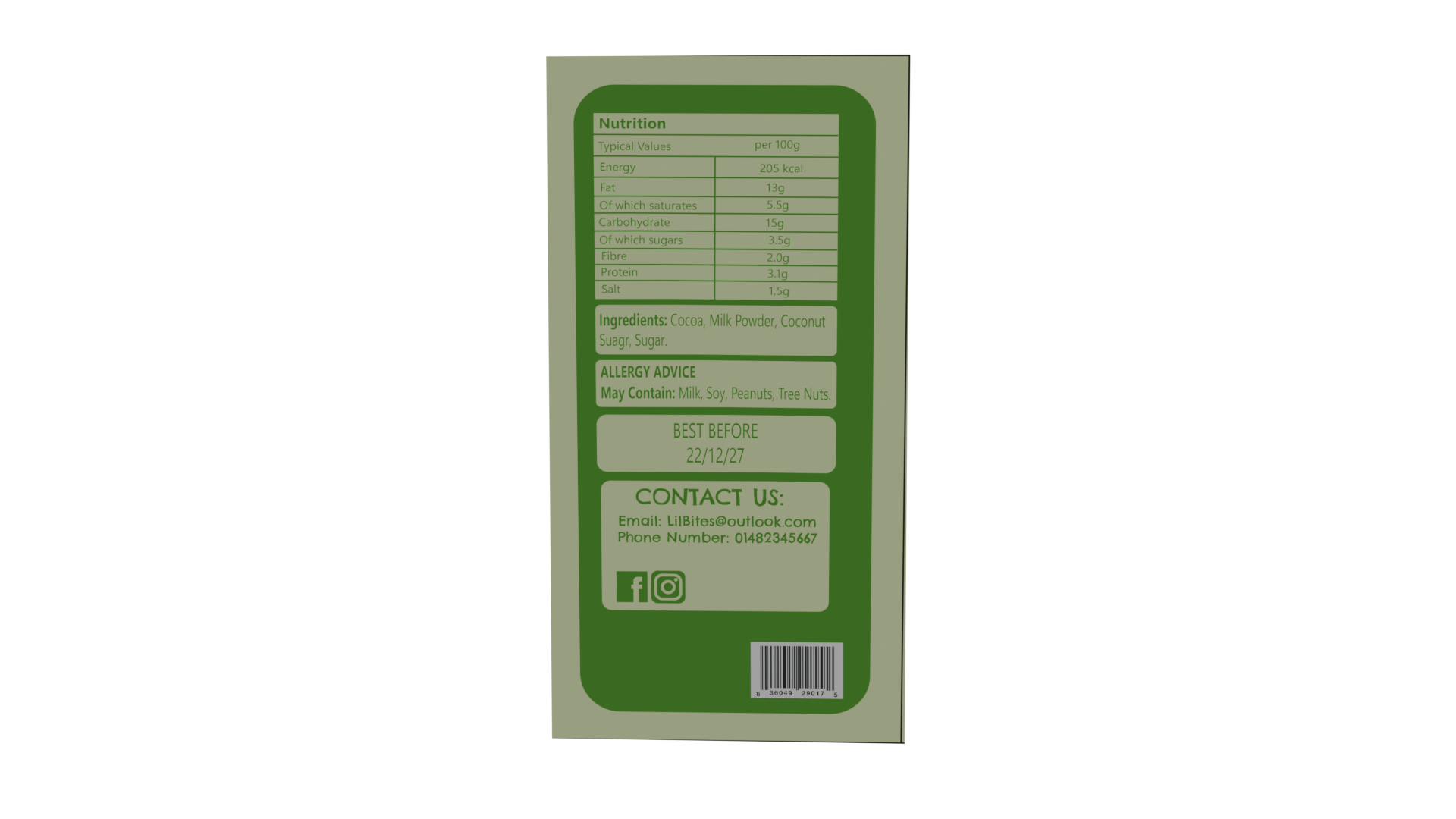
Chocolate Bar Flat Packaging
I did the same process for the chocolate bar packaging. I sketched both a flat version and a folded version of the packaging. I focused on the top and bottom sides of the packaging for this product because the sides would be too thin to have any content on except for colours or patterns. I kept the packaging similar to the ready meal packaging to show that these products were all part of the same brand and to make them look cohesive when placed together. I made the logo a little bit smaller on here but still large enough compared to other elements and to make it stand out with visual hierarchy. For the illustration, I made a design of a chocolate bar to let buyers know what the product is from a far.
Crisps Packet Sketches
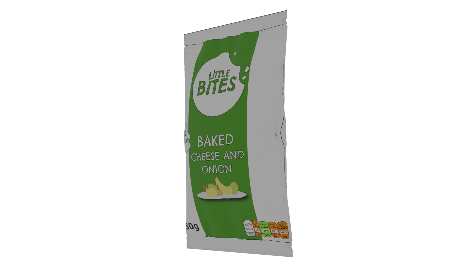
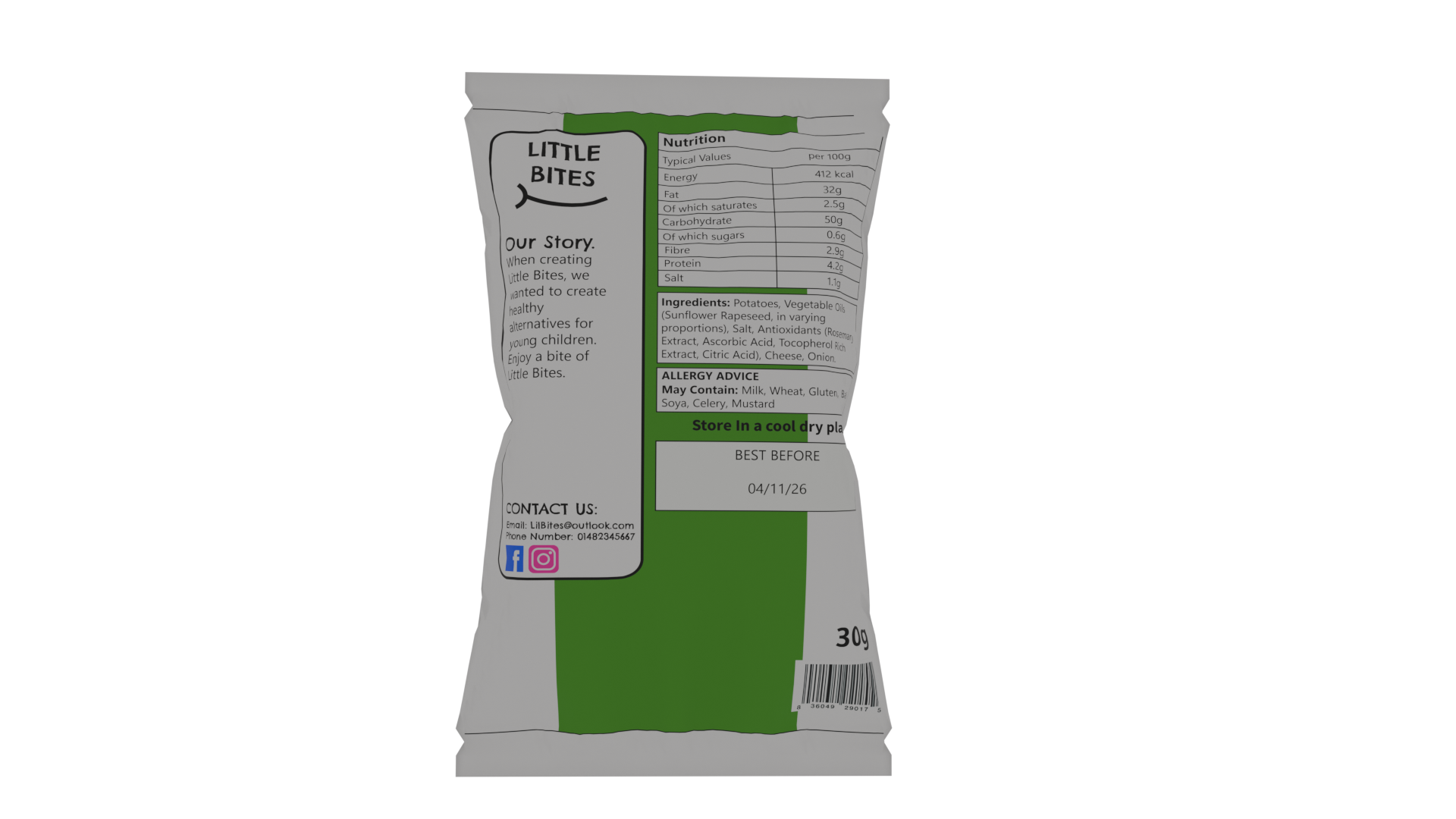
Crisps Packet Flat Packaging
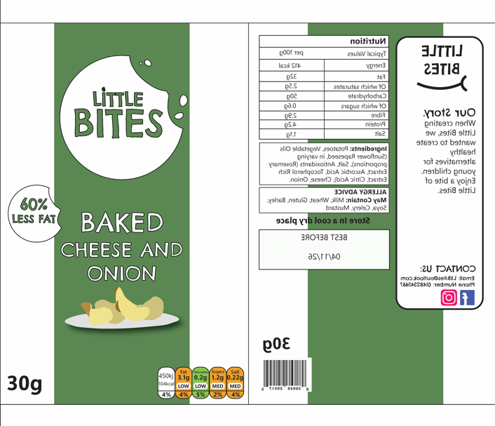
The final product was the crisps packet. I created a sketch again and decided to keep the front of the packet simpler, showing the logo, the product and the flavour. A lot of brands use green for cheese flavours, so I used the green from my brand and added a stripe down the centre of the packet to both match the brand identity and make the customer associate the colour with the flavour. To show that the crisps are healthier than the average brand, I added a sticker which says ‘60% less fat’ on the front, making the crisps more appealing to parents who are looking for a better substitute. The back of the packet has all the nutritional information, contact, and best before date.
For each product, I have made sure to add the legally required information such as the sell by date, barcodes, allergy information, ingredients and the net weight. I have also used the colour coded nutrient diagram to quickly indicate that the products are lower in fats, sugars and salts, meaning parents who are in a rush can quickly scan the product and see that they are healthier due to the green and orange colours on the nutritional values.
Some issues I faced when designing these products were that some of the information didn’t fit how I had intended and I had to rethink the layout and the sizes of elements to make sure they fit but were still legible. Another issue was that I had intially designed a smiling mouth to the designs to try and make the brand look more positive and appealing, but I didn’t think it worked very well and it threw the design off so I decided to not go with this idea. For the social media logos, I designed my own in Illustrator so that I had them ready for use in other designs later in my project, and to use in the future.
“Constructing a brand identity is an opportunity to personify a brand, bring it to life, and establish strong emotional connections with its audience.
By creating a unique and distinguishable identity, a brand can differentiate itself from its competitors and build a lasting reputation.” (Andrivet, 2023)
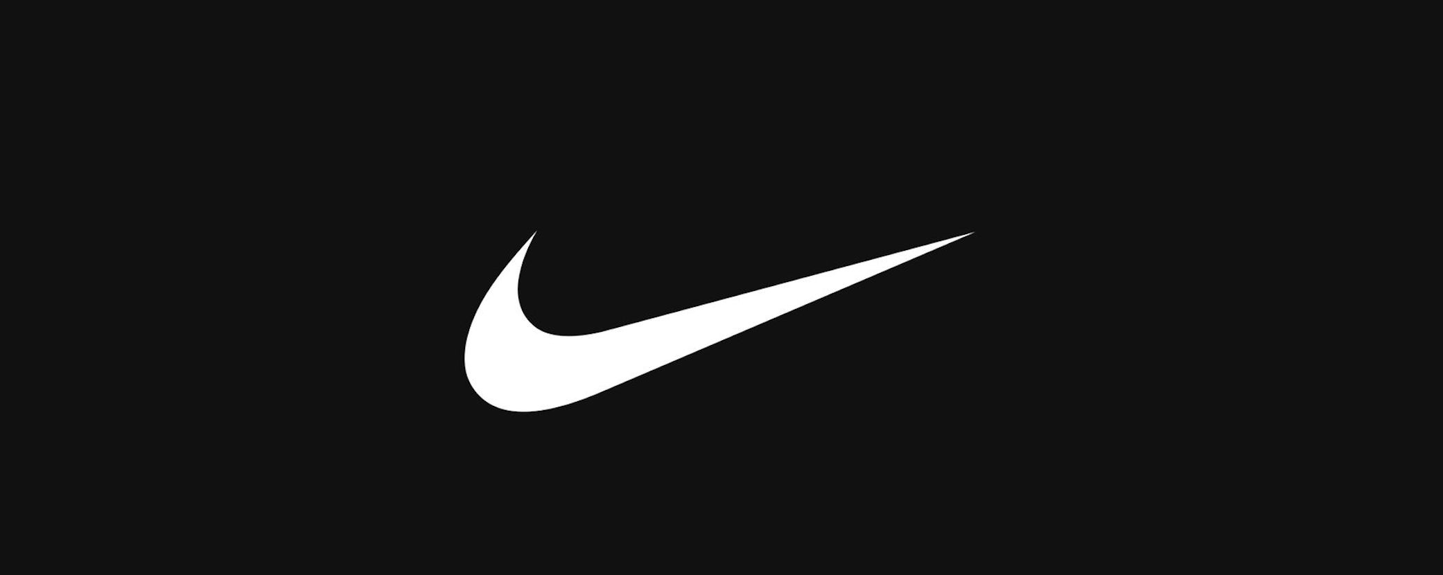
Having just a logo for a brand isn’t enough in the modern era of marketing and branding. A good logo can eventually become easy to recognise by itself, but this is more common for long established brands such as Apple or Nike, who had to spend many years building their brand and trust with their audience and still have a series of brand guidelines which are more than just a logo and include rules which make the audience connect more with them.
The Nike tick is extremely recognisable on its own
The Nike tick, or swoosh, is one of the most iconic brand icons in the world. The story behind the swoosh is that in 1971, Blue Ribbon Sports had decided to change their name to Nike after the roman goddess of victory. The point of the name was that their brand led to victories in sports. They needed a new logo for their name and asked a graphic design student named Carolyn Davidson to come up with a design which showed motion. This led to the iconic swoosh. (Kyamko, 2023)
“The Swoosh is more than just a checkmark. It represents the wing of the Greek goddess Nike, symbolizing speed, movement, power, and motivation. Davidson’s design captured the spirit of athleticism and excellence that Nike aspired to represent.” (Kyamko, 2023)
Original Nike logo drawings
Even in the early logo drawings, Carolyn Davidson offered some brand guidelines for how the logo should appear and how the typography should be used too. Brand guidelines can also outline typography, including the fonts used, sizes and positioning.
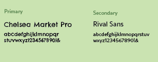
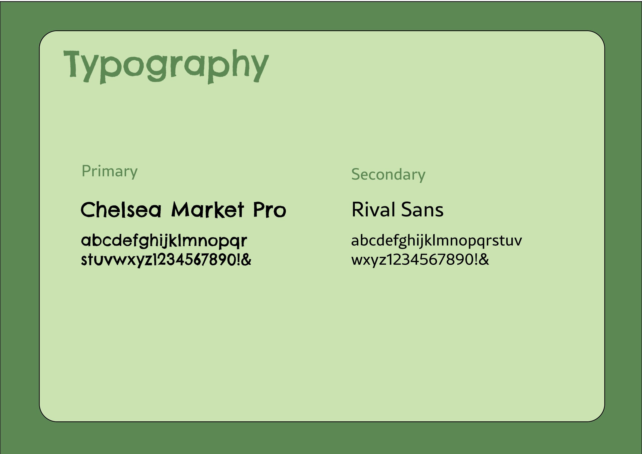
This has inspired me to think about my brand beyond my logo and how I can build a visual identity around it to support the brand and create a story. First, I will start with the typography and think about how it should appear. The font I used for the logo was an Adobe font named Chelsea Market Pro, it was fitting to the brand as it is childlike and a bit messy, so it felt more fun and playful. The jaggered hand-drawn effect of the font looked like it could have been scribbled by a young child and communicates that the brand is aimed towards a younger audience because it isn’t as sophisticated and perfected. To pair with this typeface, I used a simple but easy to read typeface called ‘Rival Sans’, because it balanced the other typography and will work better for smaller sized text such as product ingredients or descriptions on packaging like the cooking instructions, whereas Chelsea Market Pro works better for the names of products and flavours since it is bold and will draw the viewers eye straight to the important information.
The NN group say that less is more and not to overdo it with decorative fonts, which is why you should balance out your display fonts with a neutral font, especially for copy text due to the smaller size causing potential readability problems. “Reserve decorative typefaces that have a lot of personality for less-utilized elements, such as headers or illustrations. Decorative typefaces are difficult to read at small sizes and should never be used for body copy.” (Krause, 2022)
Typefaces for my brand
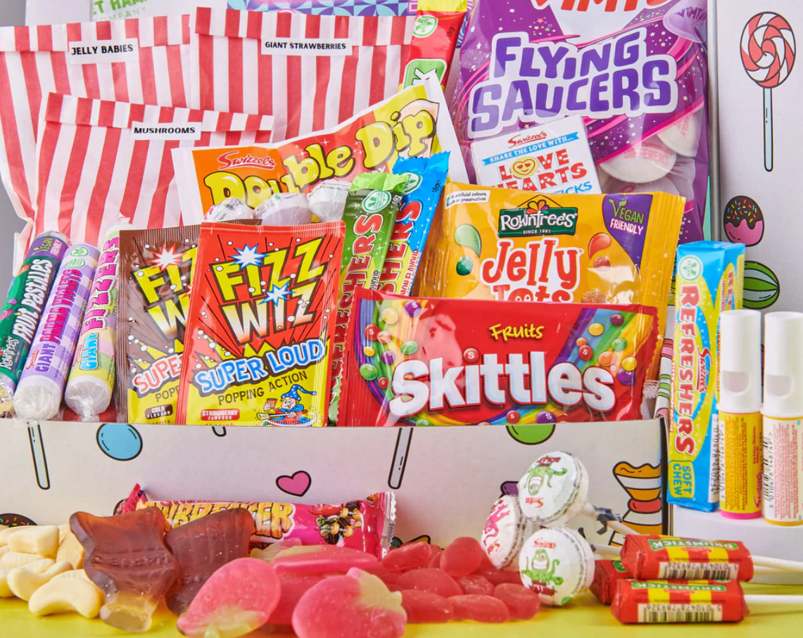
Next, I considered the colour palette of my brand. I already chose a green colour for the logo as I wanted to connect the brand with health and wellness, which green can easily be linked to due to leafy green vegetables and being natural. I noticed that a lot of brands aimed at young children use extremely bright colours and sometimes this looks acidic and unnatural, which is not what I want my brand to say. Also, this may appeal to children, but parents are usually the ones doing the food shopping, so it was important for me to think about how adults may perceive the products. If I follow in the steps of brands who use extremely saturated colours, it may accidentally group my brand in with them and put parents off.
Unhealthy sweets which use bright coloured packaging
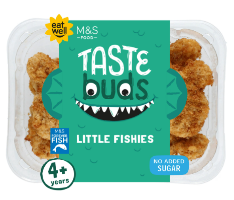
I have instead decided to use a more muted colour palette to avoid looking processed and unnatural. M&S have their own range of kids ready meals and their colour palette is less saturated and as a result it feels more healthy and organic. They keep the childish elements by using illustrated character faces which brings playfulness to make it clear that the brand is catered to kids. I want to do something similar by using illustrations or other elements to make the designs more fun without relying on crazy colour palettes.
M&S taste buds use a more muted colour palette
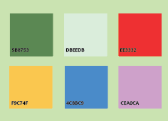
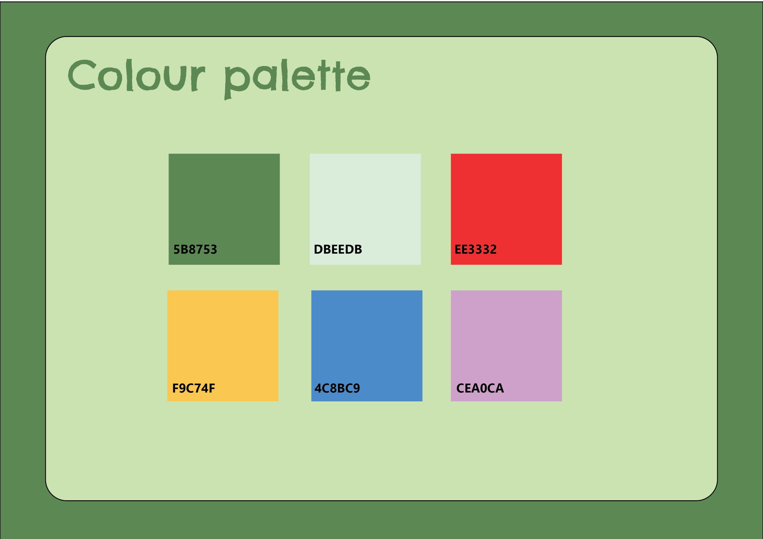
For my colour palette, I have used colours such as green and yellow to link to the healthy aspect, and paired these with colours such as blue, red and purple to also add fun and excitement. I chose to use colours which aren’t too saturated like how M&S Taste Buds do. I also added the hex values to make it easier to identify the exact shade and to make sure all brand elements are using the exact same colours.
Colour palette for my brand
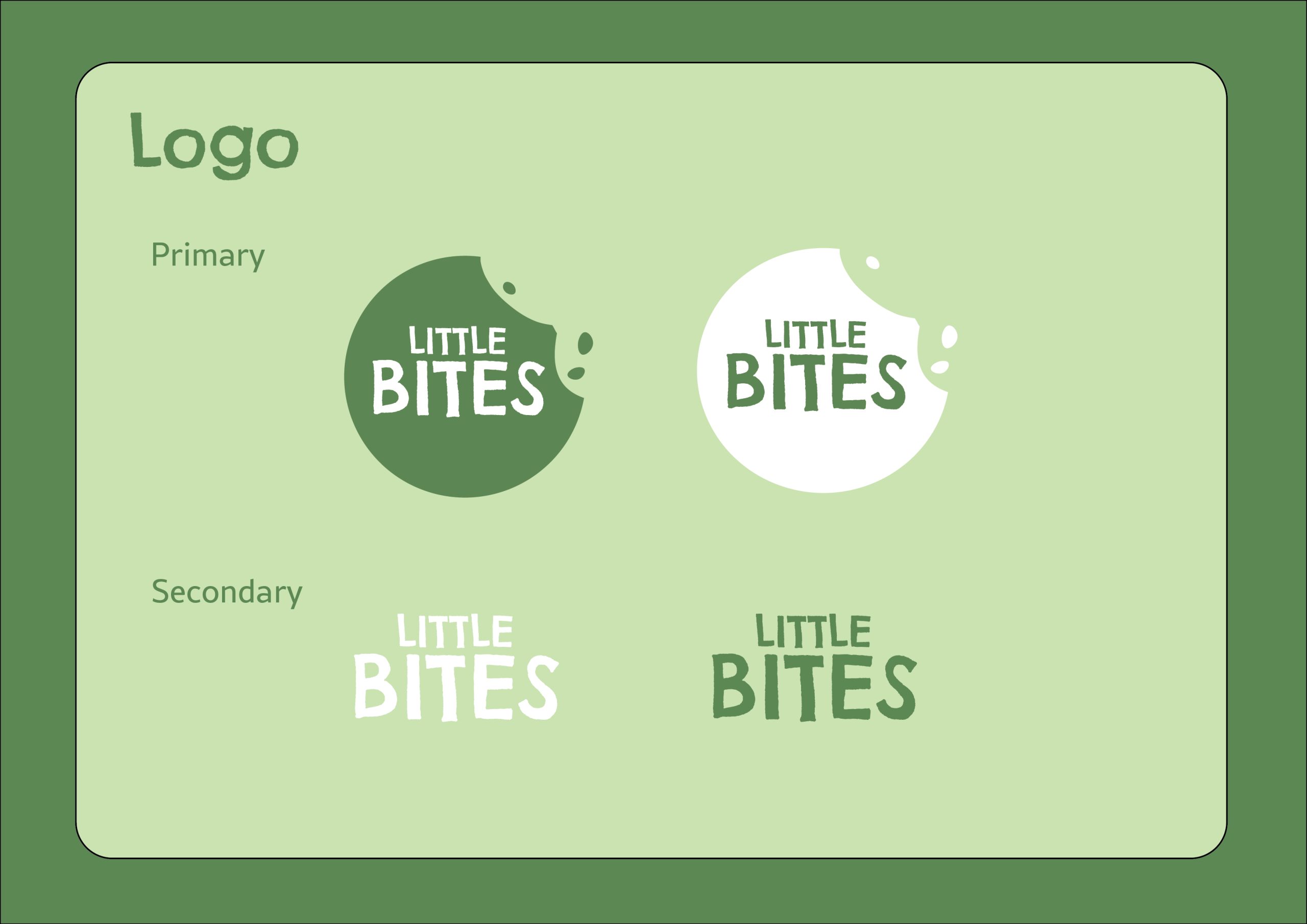
And finally, with my branding elements decided on, I now will bring all my components together into a document which will be my brand guides. Brand guides help to inform others on your identity and how to design for your brand. I have made an A3 document with information on the logos, typography and colour palette, and I have designed the brand guides to match the branding so it feels more in-line with the brand.
Logo guidelines
Typography guidelines
Colour guidelines
Reference List:
Andrivet, Marion (2023) The Power of a Strong Brand Identity: Definition, Importance, and Key Elements [Quote]. Available online: https://www.thebrandingjournal.com/2023/03/brand-identity/ [Accessed: 25/02/2025]
Kyamko, Mary (2023) Nike Logo: History, Meaning, Design Influences, and Evolution [Article]. Available online: https://www.crowdspring.com/blog/nike-logo/ [Accessed: 25/02/2025]
Kyamko, Mary (2023) Nike Logo: History, Meaning, Design Influences, and Evolution [Quote]. Available online: https://www.crowdspring.com/blog/nike-logo/ [Accessed: 25/02/2025]
M&S (2025) Taste Buds Little Fishies [Image]. Available online: Kids’ Ready Meals | M&S [Acccessed: 25/02/2025]
Nike (1971) Nike logo original drawings [Image]. Available online: https://images.crowdspring.com/blog/wp-content/uploads/2023/11/16165345/original-nike-logo-drawings.png [Accessed: 25/02/2025]
Nike (2025) Nike swoosh [Image]. Available online: https://miro.medium.com/v2/resize:fit:4164/format:webp/1*idXubtJAE8MZU-AYIHMKsQ.png [Accessed: 25/02/2025]